A Look at Machine Learning Infographic
Machine learning brings humans and machines closer by enabling humans to “teach” machines.
A Complete Guide to Decision Trees
Decision trees are among the most fundamental algorithms in supervised machine learning, used to handle both regression and classification tasks. In a nutshell, you can think of it as a glorified collection of if-else statements, but more on that later. Today you’ll learn the basic theory behind the decision trees algorithm and also how to implement the algorithm in R.Introduction to Decision Trees
Decision trees are intuitive. All they do is ask questions, like is the gender male or is the value of a particular variable higher than some threshold. Based on the answers, either more questions are asked, or the classification is made. Simple! To predict class labels, the decision tree starts from the root (root node). Calculating which attribute should represent the root node is straightforward and boils down to figuring which attribute best separates the training records. The calculation is done with the gini impurity formula. It’s simple math, but can get tedious to do manually if you have many attributes. After determining the root node, the tree “branches out” to better classify all of the impurities found in the root node. That’s why it’s common to hear decision tree = multiple if-else statements analogy. The analogy makes sense to a degree, but the conditional statements are calculated automatically. In simple words, the machine learns the best conditions for your data. Let’s take a look at the following decision tree representation to drive these points further home: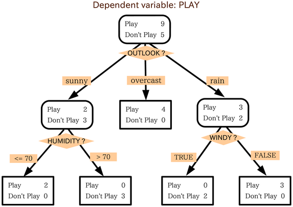 Image 1 — Example decision tree
As you can see, variables Outlook?, Humidity?, and Windy? are used to predict the dependent variable — Play.
You now know the basic theory behind the algorithm, and you’ll learn how to implement it in R next.
Image 1 — Example decision tree
As you can see, variables Outlook?, Humidity?, and Windy? are used to predict the dependent variable — Play.
You now know the basic theory behind the algorithm, and you’ll learn how to implement it in R next.
Dataset Loading and Preparation
There’s no machine learning without data, and there’s no working with data without libraries. You’ll need these ones to follow along: library(caTools) library(rpart) library(rpart.plot) library(caret) library(dplyr) head(iris) As you can see, we’ll use the Iris dataset to build our decision tree classifier. This is how the first couple of lines look like (output from thehead() function call):
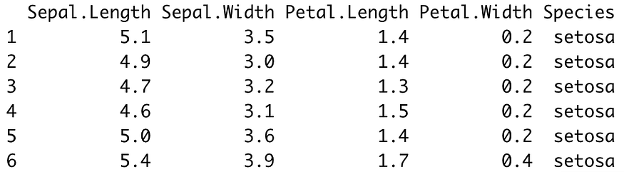 Image 2 — Iris dataset head (image by author)
The dataset is pretty much familiar to anyone with a week of experience in data science and machine learning, so it doesn’t require further introduction.
Also, the dataset is as clean as they come, which will save us a lot of time in this section.
The only thing we have to do before continuing to predictive modeling is to split this dataset randomly into training and testing subsets.
You can use the following code snippet to do a split in 75:25 ratio:
set.seed(42)
sample_split <- sample.split(Y = iris$Species, SplitRatio = 0.75)
train_set <- subset(x = iris, sample_split == TRUE)
test_set <- subset(x = iris, sample_split == FALSE)
And that’s it! Let’s start with modeling next.
Image 2 — Iris dataset head (image by author)
The dataset is pretty much familiar to anyone with a week of experience in data science and machine learning, so it doesn’t require further introduction.
Also, the dataset is as clean as they come, which will save us a lot of time in this section.
The only thing we have to do before continuing to predictive modeling is to split this dataset randomly into training and testing subsets.
You can use the following code snippet to do a split in 75:25 ratio:
set.seed(42)
sample_split <- sample.split(Y = iris$Species, SplitRatio = 0.75)
train_set <- subset(x = iris, sample_split == TRUE)
test_set <- subset(x = iris, sample_split == FALSE)
And that’s it! Let’s start with modeling next.
Modeling
We’re using therpart library to build the model.
The syntax for building models is identical as with linear and logistic regression.
You’ll need to put the target variable on the left and features on the right, separated with the ~ sign.
If you want to use all features, put a dot (.) instead of feature names.
Also, don’t forget to specify method = "class" since we’re dealing with a classification dataset here.
Here’s how to train the model:
model <- rpart(Species ~ ., data = train_set, method = "class")
model
The output of calling model is shown in the following image:
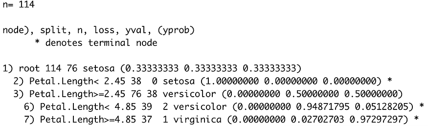 Image 3 — Decision tree classifier model (image by author)
From this image alone, you can see the “rules” decision tree model used to make classifications.
If you’d like a more visual representation, you can use the
Image 3 — Decision tree classifier model (image by author)
From this image alone, you can see the “rules” decision tree model used to make classifications.
If you’d like a more visual representation, you can use the rpart.plot package to visualize the tree:
rpart.plot(model)
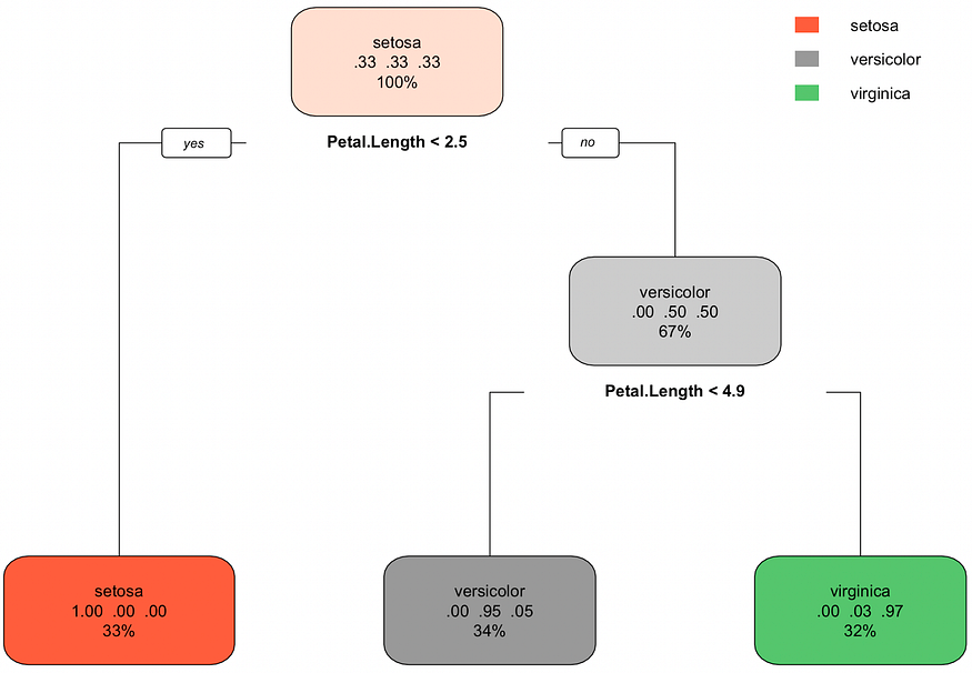 Image 4 — Visual representation of the decision tree (image by author)
You can see how many classifications were correct (in the train set) by examining the bottom nodes.
The setosa was correctly classified every time, the versicolor was misclassified for virginica 5% of the time, and virginica was misclassified for versicolor 3% of the time.
It’s a simple graph, but you can read everything from it.
Decision trees are also useful for examining feature importance, ergo, how much predictive power lies in each feature.
You can use the
Image 4 — Visual representation of the decision tree (image by author)
You can see how many classifications were correct (in the train set) by examining the bottom nodes.
The setosa was correctly classified every time, the versicolor was misclassified for virginica 5% of the time, and virginica was misclassified for versicolor 3% of the time.
It’s a simple graph, but you can read everything from it.
Decision trees are also useful for examining feature importance, ergo, how much predictive power lies in each feature.
You can use the varImp() function to find out.
The following snippet calculates the importances and sorts them descendingly:
importances <- varImp(model)
importances %>%
arrange(desc(Overall))
The results are shown in the image below:
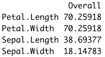 Image 5 — Feature importances (image by author)
You’ve built and explored the model so far, but there’s no use in it yet.
The next section shows you how to make predictions on previously unseen data and evaluate the model.
Image 5 — Feature importances (image by author)
You’ve built and explored the model so far, but there’s no use in it yet.
The next section shows you how to make predictions on previously unseen data and evaluate the model.
Making Predictions
Predicting new instances is now a trivial task. All you have to do is use thepredict() function and pass in the testing subset.
Also, make sure to specify type = "class" for everything to work correctly.
Here’s an example:
preds <- predict(model, newdata = test_set, type = "class")
preds
The results are shown in the following image:
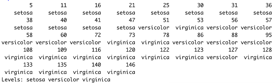 Image 6 — Decision tree predictions (image by author)
But how good are these predictions? Let’s evaluate.
The confusion matrix is one of the most commonly used metrics to evaluate classification models.
In R, it also outputs values for other metrics, such as sensitivity, specificity, and the others.
Here’s how you can print the confusion matrix:
confusionMatrix(test_set$Species, preds)
And here are the results:
Image 6 — Decision tree predictions (image by author)
But how good are these predictions? Let’s evaluate.
The confusion matrix is one of the most commonly used metrics to evaluate classification models.
In R, it also outputs values for other metrics, such as sensitivity, specificity, and the others.
Here’s how you can print the confusion matrix:
confusionMatrix(test_set$Species, preds)
And here are the results:
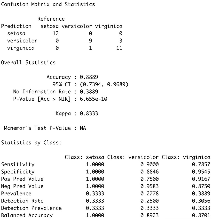 Image 7 — Confusion matrix on the test set (image by author)
As you can see, there are some misclassifications in versicolor and virginica classes, similar to what we’ve seen in the training set.
Overall, the model is just short of 90% accuracy, which is more than acceptable for a simple decision tree classifier.
Image 7 — Confusion matrix on the test set (image by author)
As you can see, there are some misclassifications in versicolor and virginica classes, similar to what we’ve seen in the training set.
Overall, the model is just short of 90% accuracy, which is more than acceptable for a simple decision tree classifier.
Conclusion
Decision trees are an excellent introductory algorithm to the whole family of tree-based algorithms. It’s commonly used as a baseline model, which more sophisticated tree-based algorithms (such as random forests and gradient boosting) need to outperform. Today you’ve learned basic logic and intuition behind decision trees, and how to implement and evaluate the algorithm in R. You can expect the whole suite of tree-based algorithms covered soon, so stay tuned if you want to learn more.Decision Trees in R
Introduction
Types of Decision Trees
Regression Trees
Classification Trees
Advantages and Disadvantages of Decision Trees
Tree-Based Methods
Bagging
Random Forests
Boosting
Decision Trees in R
Classification Trees
Random Forests
Boosting
Conclusion
Learn all about decision trees, a form of supervised learning used in a variety of ways to solve regression and classification problems.
Let's imagine you are playing a game of Twenty Questions.
Your opponent has secretly chosen a subject, and you must figure out what he/she chose.
At each turn, you may ask a yes-or-no question, and your opponent must answer truthfully.
How do you find out the secret in the fewest number of questions?
It should be obvious some questions are better than others.
For example, asking "Can it fly?" as your first question is likely to be unfruitful, whereas asking "Is it alive?" is a bit more useful.
Intuitively, you want each question to significantly narrow down the space of possibly secrets, eventually leading to your answer.
That is the basic idea behind decision trees.
At each point, you consider a set of questions that can partition your data set.
You choose the question that provides the best split and again find the best questions for the partitions.
You stop once all the points you are considering are of the same class.
Then the task of classication is easy.
You can simply grab a point, and chuck it down the tree.
The questions will guide it to its appropriate class.
Since this tutorial is in R, I highly recommend you take a look at our Introduction to R or Intermediate R course, depending on your level of advancement.
Types of Decision Trees
Regression Trees
Classification Trees
Advantages and Disadvantages of Decision Trees
Tree-Based Methods
Bagging
Random Forests
Boosting
Decision Trees in R
Classification Trees
Random Forests
Boosting
Conclusion
Introduction
Decision tree is a type of supervised learning algorithm that can be used in both regression and classification problems. It works for both categorical and continuous input and output variables.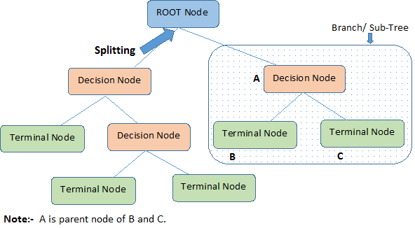 Let's identify important terminologies on Decision Tree, looking at the image above:
Root Node represents the entire population or sample.
It further gets divided into two or more homogeneous sets.
Splitting is a process of dividing a node into two or more sub-nodes.
When a sub-node splits into further sub-nodes, it is called a Decision Node.
Nodes that do not split is called a Terminal Node or a Leaf.
When you remove sub-nodes of a decision node, this process is called Pruning.
The opposite of pruning is Splitting.
A sub-section of an entire tree is called Branch.
A node, which is divided into sub-nodes is called a parent node of the sub-nodes; whereas the sub-nodes are called the child of the parent node.
Let's identify important terminologies on Decision Tree, looking at the image above:
Root Node represents the entire population or sample.
It further gets divided into two or more homogeneous sets.
Splitting is a process of dividing a node into two or more sub-nodes.
When a sub-node splits into further sub-nodes, it is called a Decision Node.
Nodes that do not split is called a Terminal Node or a Leaf.
When you remove sub-nodes of a decision node, this process is called Pruning.
The opposite of pruning is Splitting.
A sub-section of an entire tree is called Branch.
A node, which is divided into sub-nodes is called a parent node of the sub-nodes; whereas the sub-nodes are called the child of the parent node.
Types of Decision Trees
Regression Trees
Let's take a look at the image below, which helps visualize the nature of partitioning carried out by a Regression Tree. This shows an unpruned tree and a regression tree fit to a random dataset. Both the visualizations show a series of splitting rules, starting at the top of the tree. Notice that every split of the domain is aligned with one of the feature axes. The concept of axis parallel splitting generalises straightforwardly to dimensions greater than two. For a feature space of size $p$, a subset of $\mathbb{R}^p$, the space is divided into $M$ regions, $R_{m}$, each of which is a $p$-dimensional "hyperblock".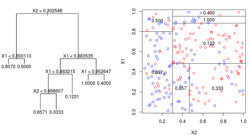 In order to build a regression tree, you first use recursive binary splititng to grow a large tree on the training data, stopping only when each terminal node has fewer than some minimum number of observations.
Recursive Binary Splitting is a greedy and top-down algorithm used to minimize the Residual Sum of Squares (RSS), an error measure also used in linear regression settings.
The RSS, in the case of a partitioned feature space with M partitions is given by:
In order to build a regression tree, you first use recursive binary splititng to grow a large tree on the training data, stopping only when each terminal node has fewer than some minimum number of observations.
Recursive Binary Splitting is a greedy and top-down algorithm used to minimize the Residual Sum of Squares (RSS), an error measure also used in linear regression settings.
The RSS, in the case of a partitioned feature space with M partitions is given by:
 Beginning at the top of the tree, you split it into 2 branches, creating a partition of 2 spaces.
You then carry out this particular split at the top of the tree multiple times and choose the split of the features that minimizes the (current) RSS.
Next, you apply cost complexity pruning to the large tree in order to obtain a sequence of best subtrees, as a function of $\alpha$.
The basic idea here is to introduce an additional tuning parameter, denoted by $\alpha$ that balances the depth of the tree and its goodness of fit to the training data.
You can use K-fold cross-validation to choose $\alpha$.
This technique simply involves dividing the training observations into K folds to estimate the test error rate of the subtrees.
Your goal is to select the one that leads to the lowest error rate.
Beginning at the top of the tree, you split it into 2 branches, creating a partition of 2 spaces.
You then carry out this particular split at the top of the tree multiple times and choose the split of the features that minimizes the (current) RSS.
Next, you apply cost complexity pruning to the large tree in order to obtain a sequence of best subtrees, as a function of $\alpha$.
The basic idea here is to introduce an additional tuning parameter, denoted by $\alpha$ that balances the depth of the tree and its goodness of fit to the training data.
You can use K-fold cross-validation to choose $\alpha$.
This technique simply involves dividing the training observations into K folds to estimate the test error rate of the subtrees.
Your goal is to select the one that leads to the lowest error rate.
Classification Trees
A classifiction tree is very similar to a regression tree, except that it is used to predict a qualitative response rather than a quantitative one. Recall that for a regression tree, the predicted response for an observation is given by the mean response of the training observations that belong to the same terminal node. In contrast, for a classification tree, you predict that each observation belongs to the most commonly occurring class of training observations in the region to which it belongs. In interpreting the results of a classification tree, you are often interested not only in the class prediction corresponding to a particular terminal node region, but also in the class proportions among the training observations that fall into that region.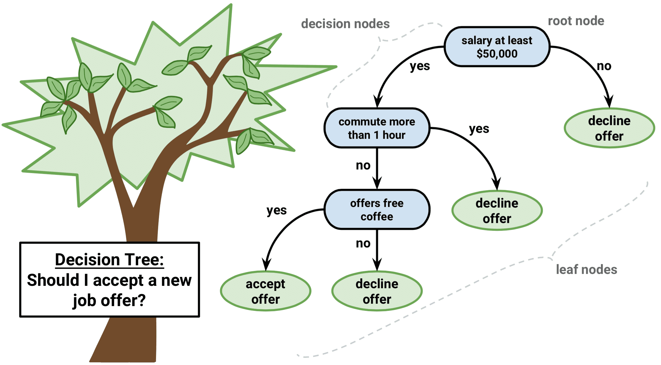 The task of growing a classification tree is quite similar to the task of growing a regression tree.
Just as in the regression setting, you use recursive binary splitting to grow a classification tree.
However, in the classification setting, Residual Sum of Squares cannot be used as a criterion for making the binary splits.
Instead, you can use either of these 3 methods below:
Classification Error Rate: Rather than seeing how far a numerical response is away from the mean value, as in the regression setting, you can instead define the "hit rate" as the fraction of training observations in a particular region that don't belong to the most widely occuring class.
The error is given by this equation:
E = 1 - argmaxc($\hat{\pi}_{mc}$)
in which $\hat{\pi}_{mc}$ represents the fraction of training data in region Rm that belong to class c.
Gini Index: The Gini Index is an alternative error metric that is designed to show how "pure" a region is.
"Purity" in this case means how much of the training data in a particular region belongs to a single class.
If a region Rm contains data that is mostly from a single class c then the Gini Index value will be small:
The task of growing a classification tree is quite similar to the task of growing a regression tree.
Just as in the regression setting, you use recursive binary splitting to grow a classification tree.
However, in the classification setting, Residual Sum of Squares cannot be used as a criterion for making the binary splits.
Instead, you can use either of these 3 methods below:
Classification Error Rate: Rather than seeing how far a numerical response is away from the mean value, as in the regression setting, you can instead define the "hit rate" as the fraction of training observations in a particular region that don't belong to the most widely occuring class.
The error is given by this equation:
E = 1 - argmaxc($\hat{\pi}_{mc}$)
in which $\hat{\pi}_{mc}$ represents the fraction of training data in region Rm that belong to class c.
Gini Index: The Gini Index is an alternative error metric that is designed to show how "pure" a region is.
"Purity" in this case means how much of the training data in a particular region belongs to a single class.
If a region Rm contains data that is mostly from a single class c then the Gini Index value will be small:
 Cross-Entropy: A third alternative, which is similar to the Gini Index, is known as the Cross-Entropy or Deviance:
The cross-entropy will take on a value near zero if the $\hat{\pi}_{mc}$’s are all near 0 or near 1.
Therefore, like the Gini index, the cross-entropy will take on a small value if the mth node is pure.
In fact, it turns out that the Gini index and the cross-entropy are quite similar numerically.
When building a classification tree, either the Gini index or the cross-entropy are typically used to evaluate the quality of a particular split, since they are more sensitive to node purity than is the classification error rate.
Any of these 3 approaches might be used when pruning the tree, but the classification error rate is preferable if prediction accuracy of the final pruned tree is the goal.
Cross-Entropy: A third alternative, which is similar to the Gini Index, is known as the Cross-Entropy or Deviance:
The cross-entropy will take on a value near zero if the $\hat{\pi}_{mc}$’s are all near 0 or near 1.
Therefore, like the Gini index, the cross-entropy will take on a small value if the mth node is pure.
In fact, it turns out that the Gini index and the cross-entropy are quite similar numerically.
When building a classification tree, either the Gini index or the cross-entropy are typically used to evaluate the quality of a particular split, since they are more sensitive to node purity than is the classification error rate.
Any of these 3 approaches might be used when pruning the tree, but the classification error rate is preferable if prediction accuracy of the final pruned tree is the goal.
Advantages and Disadvantages of Decision Trees
The major advantage of using decision trees is that they are intuitively very easy to explain. They closely mirror human decision-making compared to other regression and classification approaches. They can be displayed graphically, and they can easily handle qualitative predictors without the need to create dummy variables. However, decision trees generally do not have the same level of predictive accuracy as other approaches, since they aren't quite robust. A small change in the data can cause a large change in the final estimated tree. By aggregating many decision trees, using methods like bagging, random forests, and boosting, the predictive performance of decision trees can be substantially improved.Tree-Based Methods
Bagging
The decision trees discussed above suffer from high variance, meaning if you split the training data into 2 parts at random, and fit a decision tree to both halves, the results that you get could be quite different. In contrast, a procedure with low variance will yield similar results if applied repeatedly to distinct dataset. Bagging, or bootstrap aggregation, is a technique used to reduce the variance of your predictions by combining the result of multiple classifiers modeled on different sub-samples of the same dataset. Here is the equation for bagging: in which you generate $B$ different bootstrapped training datasets.
You then train your method on the $bth$ bootstrapped training set in order to get $\hat{f}_{b}(x)$, and finally average the predictions.
The visual below shows the 3 different steps in bagging:
in which you generate $B$ different bootstrapped training datasets.
You then train your method on the $bth$ bootstrapped training set in order to get $\hat{f}_{b}(x)$, and finally average the predictions.
The visual below shows the 3 different steps in bagging:
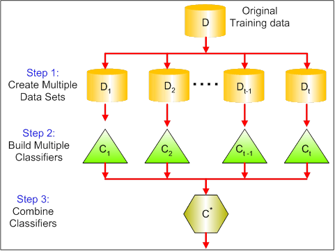 Step 1: Here you replace the original data with new data.
The new data usually have a fraction of the original data's columns and rows, which then can be used as hyper-parameters in the bagging model.
Step 2: You build classifiers on each dataset.
Generally, you can use the same classifier for making models and predictions.
Step 3: Lastly, you use an average value to combine the predictions of all the classifiers, depending on the problem.
Generally, these combined values are more robust than a single model.
While bagging can improve predictions for many regression and classification methods, it is particularly useful for decision trees.
To apply bagging to regression/classification trees, you simply construct $B$ regression/classification trees using $B$ bootstrapped training sets, and average the resulting predictions.
These trees are grown deep, and are not pruned.
Hence each individual tree has high variance, but low bias.
Averaging these $B$ trees reduces the variance.
Broadly speaking, bagging has been demonstrated to give impressive improvements in accuracy by combining together hundreds or even thousands of trees into a single procedure.
Step 1: Here you replace the original data with new data.
The new data usually have a fraction of the original data's columns and rows, which then can be used as hyper-parameters in the bagging model.
Step 2: You build classifiers on each dataset.
Generally, you can use the same classifier for making models and predictions.
Step 3: Lastly, you use an average value to combine the predictions of all the classifiers, depending on the problem.
Generally, these combined values are more robust than a single model.
While bagging can improve predictions for many regression and classification methods, it is particularly useful for decision trees.
To apply bagging to regression/classification trees, you simply construct $B$ regression/classification trees using $B$ bootstrapped training sets, and average the resulting predictions.
These trees are grown deep, and are not pruned.
Hence each individual tree has high variance, but low bias.
Averaging these $B$ trees reduces the variance.
Broadly speaking, bagging has been demonstrated to give impressive improvements in accuracy by combining together hundreds or even thousands of trees into a single procedure.
Random Forests
Random Forests is a versatile machine learning method capable of performing both regression and classification tasks. It also undertakes dimensional reduction methods, treats missing values, outlier values and other essential steps of data exploration, and does a fairly good job. Random Forests provides an improvement over bagged trees by a small tweak that decorrelates the trees. As in bagging, you build a number of decision trees on bootstrapped training samples. But when building these decision trees, each time a split in a tree is considered, a random sample of m predictors is chosen as split candidates from the full set of $p$ predictors. The split is allowed to use only one of those $m$ predictors. This is the main difference between random forests and bagging; because as in bagging, the choice of predictor $m = p$. In order to grow a random forest, you should:
First assume that the number of cases in the training set is K.
Then, take a random sample of these K cases, and then use this sample as the training set for growing the tree.
If there are $p$ input variables, specify a number $m < p$ such that at each node, you can select $m$ random variables out of the $p$.
The best split on these $m$ is used to split the node.
Each tree is subsequently grown to the largest extent possible and no pruning is needed.
Finally, aggregate the predictions of the target trees to predict new data.
Random Forests is very effective at estimating missing data and maintaining accuracy when a large proportions of the data is missing.
It can also balance errors in datasets where the classes are imbalanced.
Most importantly, it can handle massive datasets with large dimensionality.
However, one disadvantage of using Random Forests is that you might easily overfit noisy datasets, especially in the case of doing regression.
In order to grow a random forest, you should:
First assume that the number of cases in the training set is K.
Then, take a random sample of these K cases, and then use this sample as the training set for growing the tree.
If there are $p$ input variables, specify a number $m < p$ such that at each node, you can select $m$ random variables out of the $p$.
The best split on these $m$ is used to split the node.
Each tree is subsequently grown to the largest extent possible and no pruning is needed.
Finally, aggregate the predictions of the target trees to predict new data.
Random Forests is very effective at estimating missing data and maintaining accuracy when a large proportions of the data is missing.
It can also balance errors in datasets where the classes are imbalanced.
Most importantly, it can handle massive datasets with large dimensionality.
However, one disadvantage of using Random Forests is that you might easily overfit noisy datasets, especially in the case of doing regression.
Boosting
Boosting is another approach to improve the predictions resulting from a decision tree. Like bagging and random forests, it is a general approach that can be applied to many statistical learning methods for regression or classification. Recall that bagging involves creating multiple copies of the original training dataset using the bootstrap, fitting a separate decision tree to each copy, and then combining all of the trees in order to create a single predictive model. Notably, each tree is built on a bootstrapped dataset, independent of the other trees. Boosting works in a similar way, except that the trees are grown sequentially: each tree is grown using information from previously grown trees. Boosting does not involve bootstrap sampling; instead, each tree is fitted on a modified version of the original dataset.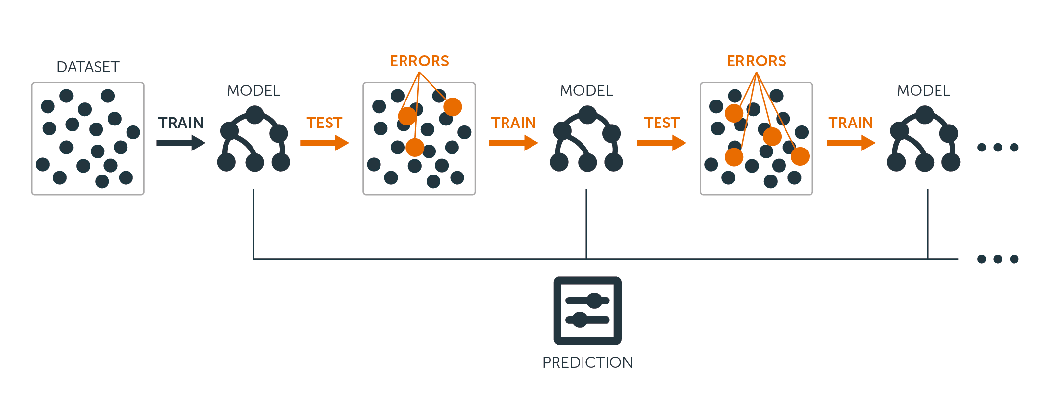 For both regression and classification trees, boosting works like this:
Unlike fitting a single large decision tree to the data, which amounts to fitting the data hard and potentially overfitting, the boosting approach instead learns slowly.
Given the current model, you fit a decision tree to the residuals from the model.
That is, you fit a tree using the current residuals, rather than the outcome $Y$, as the response.
You then add this new decision tree into the fitted function in order to update the residuals.
Each of these trees can be rather small, with just a few terminal nodes, determined by the parameter $d$ in the algorithm.
By fitting small trees to the residuals, you slowly improve $\hat{f}$ in areas where it does not perform well.
The shrinkage parameter $\nu$ slows the process down even further, allowing more and different shaped trees to attack the residuals.
Boosting is very useful when you have a lot of data and you expect the decision trees to be very complex.
Boosting has been used to solve many challenging classification and regression problems, including risk analysis, sentiment analysis, predictive advertising, price modeling, sales estimation and patient diagnosis, among others.
For both regression and classification trees, boosting works like this:
Unlike fitting a single large decision tree to the data, which amounts to fitting the data hard and potentially overfitting, the boosting approach instead learns slowly.
Given the current model, you fit a decision tree to the residuals from the model.
That is, you fit a tree using the current residuals, rather than the outcome $Y$, as the response.
You then add this new decision tree into the fitted function in order to update the residuals.
Each of these trees can be rather small, with just a few terminal nodes, determined by the parameter $d$ in the algorithm.
By fitting small trees to the residuals, you slowly improve $\hat{f}$ in areas where it does not perform well.
The shrinkage parameter $\nu$ slows the process down even further, allowing more and different shaped trees to attack the residuals.
Boosting is very useful when you have a lot of data and you expect the decision trees to be very complex.
Boosting has been used to solve many challenging classification and regression problems, including risk analysis, sentiment analysis, predictive advertising, price modeling, sales estimation and patient diagnosis, among others.
Decision Trees in R
Classification Trees
For this part, you work with theCarseats dataset using the tree package in R.
Mind that you need to install the ISLR and tree packages in your R Studio environment first.
Let's first load the Carseats dataframe from the ISLR package.
library(ISLR)
data(package="ISLR")
carseats<-Carseats
Let's also load the tree package.
require(tree)
The Carseats dataset is a dataframe with 400 observations on the following 11 variables:
Sales: unit sales in thousands
CompPrice: price charged by competitor at each location
Income: community income level in 1000s of dollars
Advertising: local ad budget at each location in 1000s of dollars
Population: regional pop in thousands
Price: price for car seats at each site
ShelveLoc: Bad, Good or Medium indicates quality of shelving location
Age: age level of the population
Education: ed level at location
Urban: Yes/No
US: Yes/No
names(carseats)
Let's take a look at the histogram of car sales:
hist(carseats$Sales)
Observe that Sales is a quantitative variable.
You want to demonstrate it using trees with a binary response.
To do so, you turn Sales into a binary variable, which will be called High.
If the sales is less than 8, it will be not high.
Otherwise, it will be high.
Then you can put that new variable High back into the dataframe.
High = ifelse(carseats$Sales<=8, "No", "Yes")
carseats = data.frame(carseats, High)
Now let's fill a model using decision trees.
Of course, you can't have the Sales variable here because your response variable High was created from Sales.
Thus, let's exclude it and fit the tree.
tree.carseats = tree(High~.-Sales, data=carseats)
Let's see the summary of your classification tree:
summary(tree.carseats)
You can see the variables involved, the number of terminal nodes, the residual mean deviance, as well as the misclassification error rate.
To make it more visual, let's plot the tree as well, then annotate it using the handy text function:
plot(tree.carseats)
text(tree.carseats, pretty = 0)
There are so many variables, making it very complicated to look at the tree.
At least, you can see that at each of the terminal nodes, they're labeled Yes or No.
At each splitting node, the variables and the value of the splitting choice are shown (for example, Price < 92.5 or Advertising < 13.5).
For a detailed summary of the tree, simply print it.
It'll be handy if you want to extact details from the tree for other purposes:
tree.carseats
It's time to prune the tree down.
Let's create a training set and a test by splitting the carseats dataframe into 250 training and 150 test samples.
First, you set a seed to make the results reproducible.
Then you take a random sample of the ID (index) numbers of the samples.
Specifically here, you sample from the set 1 to n row number of rows of car seats, which is 400.
You want a sample of size 250 (by default, sample uses without replacement).
set.seed(101)
train=sample(1:nrow(carseats), 250)
So now you get this index of train, which indexes 250 of the 400 observations.
You can refit the model with tree, using the same formula except telling the tree to use a subset equals train.
Then let's make a plot:
tree.carseats = tree(High~.-Sales, carseats, subset=train)
plot(tree.carseats)
text(tree.carseats, pretty=0)
The plot looks a bit different because of the slightly different dataset.
Nevertheless, the complexity of the tree looks roughly the same.
Now you're going to take this tree and predict it on the test set, using the predict method for trees.
Here you'll want to actually predict the class labels.
tree.pred = predict(tree.carseats, carseats[-train,], type="class")
Then you can evalute the error by using a misclassification table.
with(carseats[-train,], table(tree.pred, High))
On the diagonals are the correct classifications, while off the diagonals are the incorrect ones.
You only want to recored the correct ones.
To do that, you can take the sum of the 2 diagonals divided by the total (150 test observations).
(72 + 43) / 150
Ok, you get an error of 0.76 with this tree.
When growing a big bushy tree, it could have too much variance.
Thus, let's use cross-validation to prune the tree optimally.
Using cv.tree, you'll use the misclassification error as the basis for doing the pruning.
cv.carseats = cv.tree(tree.carseats, FUN = prune.misclass)
cv.carseats
Printing out the results shows the details of the path of the cross-validation.
You can see the sizes of the trees as they were pruned back, the deviances as the pruning proceeded, as well as the cost complexity parameter used in the process.
Let's plot this out:
plot(cv.carseats)
Looking at the plot, you see a downward spiral part because of the misclassification error on 250 cross-validated points.
So let's pick a value in the downward steps (12).
Then, let's prune the tree to a size of 12 to identify that tree.
Finally, let's plot and annotate that tree to see the outcome.
prune.carseats = prune.misclass(tree.carseats, best = 12)
plot(prune.carseats)
text(prune.carseats, pretty=0)
It's a bit shallower than previous trees, and you can actually read the labels.
Let's evaluate it on the test dataset again.
tree.pred = predict(prune.carseats, carseats[-train,], type="class")
with(carseats[-train,], table(tree.pred, High))
(74 + 39) / 150
Seems like the correct classifications dropped a little bit.
It has done about the same as your original tree, so pruning did not hurt much with respect to misclassification errors, and gave a simpler tree.
Often case, trees don't give very good prediction errors, so let's go ahead take a look at random forests and boosting, which tend to outperform trees as far as prediction and misclassification are concerned.
Random Forests
For this part, you will use theBoston housing data to explore random forests and boosting.
The dataset is located in the MASS package.
It gives housing values and other statistics in each of 506 suburbs of Boston based on a 1970 census.
library(MASS)
data(package="MASS")
boston<-Boston
dim(boston)
names(boston)
Let's also load the randomForest package.
require(randomForest)
To prepare data for random forest, let's set the seed and create a sample training set of 300 observations.
set.seed(101)
train = sample(1:nrow(boston), 300)
In this dataset, there are 506 surburbs of Boston.
For each surburb, you have variables such as crime per capita, types of industry, average # of rooms per dwelling, average proportion of age of the houses etc.
Let's use medv - the median value of owner-occupied homes for each of these surburbs, as the response variable.
Let's fit a random forest and see how well it performs.
As being said, you use the response medv, the median housing value (in $1K dollars), and the training sample set.
rf.boston = randomForest(medv~., data = boston, subset = train)
rf.boston
Printing out the random forest gives its summary: the # of trees (500 were grown), the mean squared residuals (MSR), and the percentage of variance explained.
The MSR and % variance explained are based on the out-of-bag estimates, a very clever device in random forests to get honest error estimates.
The only tuning parameter in a random Forests is the argument called mtry, which is the number of variables that are selected at each split of each tree when you make a split.
As seen here, mtry is 4 of the 13 exploratory variables (excluding medv) in the Boston Housing data - meaning that each time the tree comes to split a node, 4 variables would be selected at random, then the split would be confined to 1 of those 4 variables.
That's how randomForests de-correlates the trees.
You're going to fit a series of random forests.
There are 13 variables, so let's have mtry range from 1 to 13:
In order to record the errors, you set up 2 variables oob.err and test.err.
In a loop of mtry from 1 to 13, you first fit the randomForest with that value of mtry on the train dataset, restricting the number of trees to be 350.
Then you extract the mean-squared-error on the object (the out-of-bag error).
Then you predict on the test dataset (boston[-train]) using fit (the fit of randomForest).
Lastly, you compute the test error: mean-squared error, which is equals to mean( (medv - pred) ^ 2 ).
oob.err = double(13)
test.err = double(13)
for(mtry in 1:13){
fit = randomForest(medv~., data = boston, subset=train, mtry=mtry, ntree = 350)
oob.err[mtry] = fit$mse[350]
pred = predict(fit, boston[-train,])
test.err[mtry] = with(boston[-train,], mean( (medv-pred)^2 ))
}
Basically you just grew 4550 trees (13 times 350).
Now let's make a plot using the matplot command.
The test error and the out-of-bag error are binded together to make a 2-column matrix.
There are a few other arguments in the matrix, including the plotting character values (pch = 23 means filled diamond), colors (red and blue), type equals both (plotting both points and connecting them with the lines), and name of y-axis (Mean Squared Error).
You can also put a legend at the top right corner of the plot.
matplot(1:mtry, cbind(test.err, oob.err), pch = 23, col = c("red", "blue"), type = "b", ylab="Mean Squared Error")
legend("topright", legend = c("OOB", "Test"), pch = 23, col = c("red", "blue"))
Ideally, these 2 curves should line up, but it seems like the test error is a bit lower.
However, there's a lot of variability in these test error estimates.
Since the out-of-bag error estimate was computed on one dataset and the test error estimate was computed on another dataset, these differences are pretty much well within the standard errors.
Notice that the red curve is smoothly above the blue curve? These error estimates are very correlated, because the randomForest with mtry = 4 is very similar to the one with mtry = 5.
That's why each of the curves is quite smooth.
What you see is that mtry around 4 seems to be the most optimal choice, at least for the test error.
This value of mtry for the out-of-bag error equals 9.
So with very few tiers, you have fitted a very powerful prediction model using random forests.
How so? The left-hand side shows the performance of a single tree.
The mean squared error on out-of-bag is 26, and you've dropped down to about 15 (just a bit above half).
This means you reduced the error by half.
Likewise for the test error, you reduced the error from 20 to 12.
Boosting
Compared to random forests, boosting grows smaller and stubbier trees and goes at the bias. You will use the packageGBM (Gradient Boosted Modeling), in R.
require(gbm)
GBM asks for the distribution, which is Gaussian, because you'll be doing squared error loss.
You're going to ask GBM for 10,000 trees, which sounds like a lot, but these are going to be shallow trees.
Interaction depth is the number of splits, so you want 4 splits in each tree.
Shrinkage is 0.01, which is how much you're going to shrink the tree step back.
boost.boston = gbm(medv~., data = boston[train,], distribution = "gaussian", n.trees = 10000, shrinkage = 0.01, interaction.depth = 4)
summary(boost.boston)
The summary function gives a variable importance plot.
It seems like there are 2 variables that have high relative importance: rm (number of rooms) and lstat (percentage of lower economic status people in the community).
Let's plot these 2 variables:
plot(boost.boston,i="lstat")
plot(boost.boston,i="rm")
The 1st plot shows that the higher the proportion of lower status people in the suburb, the lower the value of the housing prices.
The 2nd plot shows the reversed relationship with the number of rooms: the average number of rooms in the house increases as the price increases.
It's time to predict a boosted model on the test dataset.
Let's look at the test performance as a function of the number of trees:
First, you make a grid of number of trees in steps of 100 from 100 to 10,000.
Then, you run the predict function on the boosted model.
It takes n.trees as an argument, and produces a matrix of predictions on the test data.
The dimensions of the matrix are 206 test observations and 100 different predict vectors at the 100 different values of tree.
n.trees = seq(from = 100, to = 10000, by = 100)
predmat = predict(boost.boston, newdata = boston[-train,], n.trees = n.trees)
dim(predmat)
It's time to compute the test error for each of the predict vectors:
predmat is a matrix, medv is a vector, thus (predmat - medv) is a matrix of differences.
You can use the apply function to the columns of these square differences (the mean).
That would compute the column-wise mean squared error for the predict vectors.
Then you make a plot using similar parameters to that one used for Random Forest.
It would show a boosting error plot.
boost.err = with(boston[-train,], apply( (predmat - medv)^2, 2, mean) )
plot(n.trees, boost.err, pch = 23, ylab = "Mean Squared Error", xlab = "# Trees", main = "Boosting Test Error")
abline(h = min(test.err), col = "red")
The boosting error pretty much drops down as the number of trees increases.
This is an evidence showing that boosting is reluctant to overfit.
Let's also include the best test error from the randomForest into the plot.
Boosting actually gets a reasonable amount below the test error for randomForest.
Conclusion
So that's the end of this R tutorial on building decision tree models: classification trees, random forests, and boosted trees. The latter 2 are powerful methods that you can use anytime as needed. In my experience, boosting usually outperforms RandomForest, but RandomForest is easier to implement. In RandomForest, the only tuning parameter is the number of trees; while in boosting, more tuning parameters are required besides the number of trees, including the shrinkage and the interaction depth.Ordinary Least Squares (OLS) Linear Regression in R
Ordinary Least Squares (OLS) linear regression is a statistical technique used for the analysis and modelling of linear relationships between a response variable and one or more predictor variables. If the relationship between two variables appears to be linear, then a straight line can be fit to the data in order to model the relationship. The linear equation (or equation for a straight line) for a bivariate regression takes the following form:y = mx + c
where y is the response (dependent) variable, m is the gradient (slope), x is the predictor (independent) variable, and c is the intercept. The modelling application of OLS linear regression allows one to predict the value of the response variable for varying inputs of the predictor variable given the slope and intercept coefficients of the line of best fit. The line of best fit is calculated in R using the lm() function which outputs the slope and intercept coefficients. The slope and intercept can also be calculated from five summary statistics: the standard deviations of x and y, the means of x and y, and the Pearson correlation coefficient between x and y variables. slope <- cor(x, y) * (sd(y) / sd(x)) intercept <- mean(y) - (slope * mean(x)) The scatterplot is the best way to assess linearity between two numeric variables. From a scatterplot, the strength, direction and form of the relationship can be identified. To carry out a linear regression in R, one needs only the data they are working with and the lm() and predict() base R functions. In this brief tutorial, two packages are used which are not part of base R. They are dplyr and ggplot2. The built-in mtcars dataset in R is used to visualise the bivariate relationship between fuel efficiency (mpg) and engine displacement (disp). library(dplyr) library(ggplot2) mtcars %>% ggplot(aes(x = disp, y = mpg)) + geom_point(colour = "red") Upon visual inspection, the relationship appears to be linear, has a negative direction, and looks to be moderately strong.
The strength of the relationship can be quantified using the Pearson correlation coefficient.
cor(mtcars$disp, mtcars$mpg)
[1] -0.8475514
This is a strong negative correlation.
Note that correlation does not imply causation.
It just indicates whether a mutual relationship, causal or not, exists between variables.
If the relationship is non-linear, a common approach in linear regression modelling is to transform the response and predictor variable in order to coerce the relationship to one that is more linear.
Common transformations include natural and base ten logarithmic, square root, cube root and inverse transformations.
The mpg and disp relationship is already linear but it can be strengthened using a square root transformation.
mtcars %>%
ggplot(aes(x = sqrt(disp), y = sqrt(mpg))) +
geom_point(colour = "red")
cor(sqrt(mtcars$disp), sqrt(mtcars$mpg))
[1] -0.8929046
Upon visual inspection, the relationship appears to be linear, has a negative direction, and looks to be moderately strong.
The strength of the relationship can be quantified using the Pearson correlation coefficient.
cor(mtcars$disp, mtcars$mpg)
[1] -0.8475514
This is a strong negative correlation.
Note that correlation does not imply causation.
It just indicates whether a mutual relationship, causal or not, exists between variables.
If the relationship is non-linear, a common approach in linear regression modelling is to transform the response and predictor variable in order to coerce the relationship to one that is more linear.
Common transformations include natural and base ten logarithmic, square root, cube root and inverse transformations.
The mpg and disp relationship is already linear but it can be strengthened using a square root transformation.
mtcars %>%
ggplot(aes(x = sqrt(disp), y = sqrt(mpg))) +
geom_point(colour = "red")
cor(sqrt(mtcars$disp), sqrt(mtcars$mpg))
[1] -0.8929046
 The next step is to determine whether the relationship is statistically significant and not just some random occurrence.
This is done by investigating the variance of the data points about the fitted line.
If the data fit well to the line, then the relationship is likely to be a real effect.
The goodness of fit can be quantified using the root mean squared error (RMSE) and R-squared metrics.
The RMSE represents the variance of the model errors and is an absolute measure of fit which has units identical to the response variable. R-squared is simply the Pearson correlation coefficient squared and represents variance explained in the response variable by the predictor variable.
The number of data points is also important and influences the p-value of the model.
A rule of thumb for OLS linear regression is that at least 20 data points are required for a valid model.
The p-value is the probability of there being no relationship (the null hypothesis) between the variables.
An OLS linear model is now fit to the transformed data.
mtcars %>%
ggplot(aes(x = sqrt(disp), y = sqrt(mpg))) +
geom_point(colour = "red") +
geom_smooth(method = "lm", fill = NA)
The next step is to determine whether the relationship is statistically significant and not just some random occurrence.
This is done by investigating the variance of the data points about the fitted line.
If the data fit well to the line, then the relationship is likely to be a real effect.
The goodness of fit can be quantified using the root mean squared error (RMSE) and R-squared metrics.
The RMSE represents the variance of the model errors and is an absolute measure of fit which has units identical to the response variable. R-squared is simply the Pearson correlation coefficient squared and represents variance explained in the response variable by the predictor variable.
The number of data points is also important and influences the p-value of the model.
A rule of thumb for OLS linear regression is that at least 20 data points are required for a valid model.
The p-value is the probability of there being no relationship (the null hypothesis) between the variables.
An OLS linear model is now fit to the transformed data.
mtcars %>%
ggplot(aes(x = sqrt(disp), y = sqrt(mpg))) +
geom_point(colour = "red") +
geom_smooth(method = "lm", fill = NA)
 The model object can be created as follows.
lmodel <- lm(sqrt(mpg) ~ sqrt(disp), data = mtcars)
The slope and the intercept can be obtained.
lmodel$coefficients
(Intercept) sqrt(disp)
6.5192052 -0.1424601
And the model summary contains the important statistical information.
summary(lmodel)
Call:
lm(formula = sqrt(mpg) ~ sqrt(disp), data = mtcars)
Residuals:
Min 1Q Median 3Q Max
-0.45591 -0.21505 -0.07875 0.16790 0.71178
Coefficients:
Estimate Std.
Error t value Pr(>|t|)
(Intercept) 6.51921 0.19921 32.73 < 2e-16 ***
sqrt(disp) -0.14246 0.01312 -10.86 6.44e-12 ***
---
Signif.
codes: 0 ‘***’ 0.001 ‘**’ 0.01 ‘*’ 0.05 ‘.’ 0.1 ‘ ’ 1
Residual standard error: 0.3026 on 30 degrees of freedom
Multiple R-squared: 0.7973, Adjusted R-squared: 0.7905
F-statistic: 118 on 1 and 30 DF, p-value: 6.443e-12
The p-value of 6.443e-12 indicates a statistically significant relationship at the p<0.001 cut-off level.
The multiple R-squared value (R-squared) of 0.7973 gives the variance explained and can be used as a measure of predictive power (in the absence of overfitting).
The RMSE is also included in the output (Residual standard error) where it has a value of 0.3026.
The take home message from the output is that for every unit increase in the square root of engine displacement there is a -0.14246 decrease in the square root of fuel efficiency (mpg).
Therefore, fuel efficiency decreases with increasing engine displacement.
The model object can be created as follows.
lmodel <- lm(sqrt(mpg) ~ sqrt(disp), data = mtcars)
The slope and the intercept can be obtained.
lmodel$coefficients
(Intercept) sqrt(disp)
6.5192052 -0.1424601
And the model summary contains the important statistical information.
summary(lmodel)
Call:
lm(formula = sqrt(mpg) ~ sqrt(disp), data = mtcars)
Residuals:
Min 1Q Median 3Q Max
-0.45591 -0.21505 -0.07875 0.16790 0.71178
Coefficients:
Estimate Std.
Error t value Pr(>|t|)
(Intercept) 6.51921 0.19921 32.73 < 2e-16 ***
sqrt(disp) -0.14246 0.01312 -10.86 6.44e-12 ***
---
Signif.
codes: 0 ‘***’ 0.001 ‘**’ 0.01 ‘*’ 0.05 ‘.’ 0.1 ‘ ’ 1
Residual standard error: 0.3026 on 30 degrees of freedom
Multiple R-squared: 0.7973, Adjusted R-squared: 0.7905
F-statistic: 118 on 1 and 30 DF, p-value: 6.443e-12
The p-value of 6.443e-12 indicates a statistically significant relationship at the p<0.001 cut-off level.
The multiple R-squared value (R-squared) of 0.7973 gives the variance explained and can be used as a measure of predictive power (in the absence of overfitting).
The RMSE is also included in the output (Residual standard error) where it has a value of 0.3026.
The take home message from the output is that for every unit increase in the square root of engine displacement there is a -0.14246 decrease in the square root of fuel efficiency (mpg).
Therefore, fuel efficiency decreases with increasing engine displacement.
Linear Regression Example using lm()
Simple (One Variable) and Multiple Linear Regression
Interpreting R's Regression Output
Analyzing Residuals
Residuals are normally distributed
Residuals are independent
Residuals are Normally Distributed
Residuals are independent
Residuals have constant variance
Recap / Highlights
Summary: R linear regression uses the lm() function to create a regression model given some formula, in the form of Y~X+X2.
To look at the model, you use the summary() function.
To analyze the residuals, you pull out the $resid variable from your new model.
Residuals are the differences between the prediction and the actual results and you need to analyze these differences to find ways to improve your regression model.
To do linear (simple and multiple) regression in R you need the built-in lm function.
Here's the data we will use, one year of marketing spend and company sales by month.
Download: CSV
Assuming you've downloaded the CSV, we'll read the data in to R and call it the dataset variable
#You may need to use the setwd(directory-name) command to
#change your working directory to wherever you saved the csv.
#Use getwd() to see what your current directory is.
dataset = read.csv("data-marketing-budget-12mo.csv", header=T,
colClasses = c("numeric", "numeric", "numeric"))
Interpreting R's Regression Output
Analyzing Residuals
Residuals are normally distributed
Residuals are independent
Residuals are Normally Distributed
Residuals are independent
Residuals have constant variance
Recap / Highlights
Simple (One Variable) and Multiple Linear Regression
The predictor (or independent) variable for our linear regression will be Spend (notice the capitalized S) and the dependent variable (the one we're trying to predict) will be Sales (again, capital S). The lm function really just needs a formula (Y~X) and then a data source. We'll use Sales~Spend, data=dataset and we'll call the resulting linear model "fit". simple.fit = lm(Sales~Spend, data=dataset) summary(simple.fit) multi.fit = lm(Sales~Spend+Month, data=dataset) summary(multi.fit) Notices on the multi.fit line the Spend variables is accompanied by the Month variable and a plus sign (+). The plus sign includes the Month variable in the model as a predictor (independent) variable. The summary function outputs the results of the linear regression model.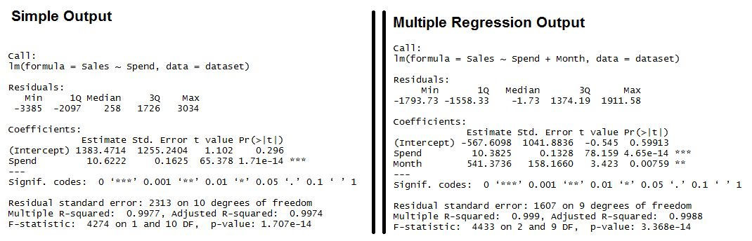 Output for R's lm Function showing the formula used, the summary statistics for the residuals, the coefficients (or weights) of the predictor variable, and finally the performance measures including RMSE, R-squared, and the F-Statistic.
Both models have significant models (see the F-Statistic for Regression) and the Multiple R-squared and Adjusted R-squared are both exceptionally high (keep in mind, this is a simplified example).
We also see that all of the variables are significant (as indicated by the "**")
Output for R's lm Function showing the formula used, the summary statistics for the residuals, the coefficients (or weights) of the predictor variable, and finally the performance measures including RMSE, R-squared, and the F-Statistic.
Both models have significant models (see the F-Statistic for Regression) and the Multiple R-squared and Adjusted R-squared are both exceptionally high (keep in mind, this is a simplified example).
We also see that all of the variables are significant (as indicated by the "**")
Interpreting R's Regression Output
Residuals: The section summarizes the residuals, the error between the prediction of the model and the actual results. Smaller residuals are better. Coefficients: For each variable and the intercept, a weight is produced and that weight has other attributes like the standard error, a t-test value and significance. Estimate: This is the weight given to the variable. In the simple regression case (one variable plus the intercept), for every one dollar increase in Spend, the model predicts an increase of $10.6222. Std. Error: Tells you how precisely was the estimate measured. It's really only useful for calculating the t-value. t-value and Pr(>[t]): The t-value is calculated by taking the coefficient divided by the Std. Error. It is then used to test whether or not the coefficient is significantly different from zero. If it isn't significant, then the coefficient really isn't adding anything to the model and could be dropped or investigated further. Pr(>|t|) is the significance level. Performance Measures: Three sets of measurements are provided. Residual Standard Error: This is the standard deviation of the residuals. Smaller is better. Multiple / Adjusted R-Square: For one variable, the distinction doesn't really matter. R-squared shows the amount of variance explained by the model. Adjusted R-Square takes into account the number of variables and is most useful for multiple-regression. F-Statistic: The F-test checks if at least one variable's weight is significantly different than zero. This is a global test to help asses a model. If the p-value is not significant (e.g. greater than 0.05) than your model is essentially not doing anything. Need more concrete explanations? I explain summary output on this page. With the descriptions out of the way, let's start interpreting. Residuals: We can see that the multiple regression model has a smaller range for the residuals: -3385 to 3034 vs. -1793 to 1911.
Secondly the median of the multiple regression is much closer to 0 than the simple regression model.
Coefficients:
(Intercept): The intercept is the left over when you average the independent and dependent variable.
In the simple regression we see that the intercept is much larger meaning there's a fair amount left over.
Multiple regression shows a negative intercept but it's closer to zero than the simple regression output.
Spend: Both simple and multiple regression shows that for every dollar you spend, you should expect to get around 10 dollars in sales.
Month: When we add in the Month variable it's multiplying this variable times the numeric (ordinal) value of the month.
So for every month you are in the year, you add an additional 541 in sales.
So February adds in $1,082 while December adds $6,492 in Sales.
Performance Measures:
Residual Standard Error: The simple regression model has a much higher standard error, meaning the residuals have a greater variance.
A 2,313 standard error is pretty high considering the average sales is $70,870.
Multiple / Adjusted R-Square: The R-squared is very high in both cases.
The Adjusted R-square takes in to account the number of variables and so it's more useful for the multiple regression analysis.
F-Statistic: The F-test is statistically significant.
This means that both models have at least one variable that is significantly different than zero.
Residuals: We can see that the multiple regression model has a smaller range for the residuals: -3385 to 3034 vs. -1793 to 1911.
Secondly the median of the multiple regression is much closer to 0 than the simple regression model.
Coefficients:
(Intercept): The intercept is the left over when you average the independent and dependent variable.
In the simple regression we see that the intercept is much larger meaning there's a fair amount left over.
Multiple regression shows a negative intercept but it's closer to zero than the simple regression output.
Spend: Both simple and multiple regression shows that for every dollar you spend, you should expect to get around 10 dollars in sales.
Month: When we add in the Month variable it's multiplying this variable times the numeric (ordinal) value of the month.
So for every month you are in the year, you add an additional 541 in sales.
So February adds in $1,082 while December adds $6,492 in Sales.
Performance Measures:
Residual Standard Error: The simple regression model has a much higher standard error, meaning the residuals have a greater variance.
A 2,313 standard error is pretty high considering the average sales is $70,870.
Multiple / Adjusted R-Square: The R-squared is very high in both cases.
The Adjusted R-square takes in to account the number of variables and so it's more useful for the multiple regression analysis.
F-Statistic: The F-test is statistically significant.
This means that both models have at least one variable that is significantly different than zero.
Analyzing Residuals
Anyone can fit a linear model in R. The real test is analyzing the residuals (the error or the difference between actual and predicted results). There are four things we're looking for when analyzing residuals. The mean of the errors is zero (and the sum of the errors is zero) The distribution of the errors are normal. All of the errors are independent. Variance of errors is constant (Homoscedastic) In R, you pull out the residuals by referencing the model and then the resid variable inside the model. Using the simple linear regression model (simple.fit) we'll plot a few graphs to help illustrate any problems with the model. layout(matrix(c(1,1,2,3),2,2,byrow=T))
#Spend x Residuals Plot
plot(simple.fit$resid~dataset$Spend[order(dataset$Spend)],
main="Spend x Residuals\nfor Simple Regression",
xlab="Marketing Spend", ylab="Residuals")
abline(h=0,lty=2)
#Histogram of Residuals
hist(simple.fit$resid, main="Histogram of Residuals",
ylab="Residuals")
#Q-Q Plot
qqnorm(simple.fit$resid)
qqline(simple.fit$resid)
layout(matrix(c(1,1,2,3),2,2,byrow=T))
#Spend x Residuals Plot
plot(simple.fit$resid~dataset$Spend[order(dataset$Spend)],
main="Spend x Residuals\nfor Simple Regression",
xlab="Marketing Spend", ylab="Residuals")
abline(h=0,lty=2)
#Histogram of Residuals
hist(simple.fit$resid, main="Histogram of Residuals",
ylab="Residuals")
#Q-Q Plot
qqnorm(simple.fit$resid)
qqline(simple.fit$resid)
Residuals are normally distributed
The histogram and QQ-plot are the ways to visually evaluate if the residual fit a normal distribution. If the histogram looks like a bell-curve it might be normally distributed. If the QQ-plot has the vast majority of points on or very near the line, the residuals may be normally distributed. The plots don't seem to be very close to a normal distribution, but we can also use a statistical test. The Jarque-Bera test (in the fBasics library, which checks if the skewness and kurtosis of your residuals are similar to that of a normal distribution. The Null hypothesis of the jarque-bera test is that skewness and kurtosis of your data are both equal to zero (same as the normal distribution). library(fBasics) jarqueberaTest(simple.fit$resid) #Test residuals for normality #Null Hypothesis: Skewness and Kurtosis are equal to zero #Residuals X-squared: 0.9575 p Value: 0.6195 With a p value of 0.6195, we fail to reject the null hypothesis that the skewness and kurtosis of residuals are statistically equal to zero.Residuals are independent
The Durbin-Watson test is used in time-series analysis to test if there is a trend in the data based on previous instances - e.g. a seasonal trend or a trend every other data point. Using the lmtest library, we can call the "dwtest" function on the model to check if the residuals are independent of one another. The Null hypothesis of the Durbin-Watson test is that the errors are serially UNcorrelated. library(lmtest) #dwtest dwtest(simple.fit) #Test for independence of residuals #Null Hypothesis: Errors are serially UNcorrelated #Results: DW = 1.1347, p-value = 0.03062 Based on the results, we can reject the null hypothesis that the errors are serially uncorrelated. This means we have more work to do. Let's try going through these motions for the multiple regression model. layout(matrix(c(1,2,3,4),2,2,byrow=T))
plot(multi.fit$fitted, rstudent(multi.fit),
main="Multi Fit Studentized Residuals",
xlab="Predictions",ylab="Studentized Resid",
ylim=c(-2.5,2.5))
abline(h=0, lty=2)
plot(dataset$Month, multi.fit$resid,
main="Residuals by Month",
xlab="Month",ylab="Residuals")
abline(h=0,lty=2)
hist(multi.fit$resid,main="Histogram of Residuals")
qqnorm(multi.fit$resid)
qqline(multi.fit$resid)
layout(matrix(c(1,2,3,4),2,2,byrow=T))
plot(multi.fit$fitted, rstudent(multi.fit),
main="Multi Fit Studentized Residuals",
xlab="Predictions",ylab="Studentized Resid",
ylim=c(-2.5,2.5))
abline(h=0, lty=2)
plot(dataset$Month, multi.fit$resid,
main="Residuals by Month",
xlab="Month",ylab="Residuals")
abline(h=0,lty=2)
hist(multi.fit$resid,main="Histogram of Residuals")
qqnorm(multi.fit$resid)
qqline(multi.fit$resid)
Residuals are Normally Distributed
Histogram of residuals does not look normally distributed. However, the QQ-Plot shows only a handful of points off of the normal line. We fail to reject the Jarque-Bera null hypothesis (p-value = 0.5059) library(fBasics) jarqueberaTest(multi.fit$resid) #Test residuals for normality #Null Hypothesis: Skewness and Kurtosis are equal to zero #Residuals X-squared: 1.3627 p Value: 0.5059Residuals are independent
We fail to reject the Durbin-Watson test's null hypothesis (p-value 0.3133) library(lmtest) #dwtest dwtest(multi.fit) #Test for independence of residuals #Null Hypothesis: Errors are serially UNcorrelated #Results: DW = 2.1077, p-value = 0.3133Residuals have constant variance
Constant variance can be checked by looking at the "Studentized" residuals - normalized based on the standard deviation. "Studentizing" lets you compare residuals across models. The Multi Fit Studentized Residuals plot shows that there aren't any obvious outliers. If a point is well beyond the other points in the plot, then you might want to investigate. Based on the plot above, I think we're okay to assume the constant variance assumption. More data would definitely help fill in some of the gaps.Recap / Highlights
Regression is a powerful tool for predicting numerical values. R's lm function creates a regression model. Use the summary function to review the weights and performance measures. The residuals can be examined by pulling on the $resid variable from your model. You need to check your residuals against these four assumptions. The mean of the errors is zero (and the sum of the errors is zero). The distribution of the errors are normal. All of the errors are independent. Variance of errors is constant (Homoscedastic) Here's the full code below dataset = read.csv("data-marketing-budget-12mo.csv", header=T, colClasses = c("numeric", "numeric", "numeric")) head(dataset,5) #/////Simple Regression///// simple.fit = lm(Sales~Spend,data=dataset) summary(simple.fit) #Loading the necessary libraries library(lmtest) #dwtest library(fBasics) #JarqueBeraTest #Testing normal distribution and independence assumptions jarqueberaTest(simple.fit$resid) #Test residuals for normality #Null Hypothesis: Skewness and Kurtosis are equal to zero dwtest(simple.fit) #Test for independence of residuals #Null Hypothesis: Errors are serially UNcorrelated #Simple Regression Residual Plots layout(matrix(c(1,1,2,3),2,2,byrow=T)) #Spend x Residuals Plot plot(simple.fit$resid~dataset$Spend[order(dataset$Spend)], main="Spend x Residuals\nfor Simple Regression", xlab="Marketing Spend", ylab="Residuals") abline(h=0,lty=2) #Histogram of Residuals hist(simple.fit$resid, main="Histogram of Residuals", ylab="Residuals") #Q-Q Plot qqnorm(simple.fit$resid) qqline(simple.fit$resid) #///////////Multiple Regression Example/////////// multi.fit = lm(Sales~Spend+Month, data=dataset) summary(multi.fit) #Residual Analysis for Multiple Regression dwtest(multi.fit) #Test for independence of residuals #Null Hypothesis: Errors are serially UNcorrelated jarqueberaTest(multi.fit$resid) #Test residuals for normality #Null Hypothesis: Skewness and Kurtosis are equal to zero #Multiple Regression Residual Plots layout(matrix(c(1,2,3,4),2,2,byrow=T)) plot(multi.fit$fitted, rstudent(multi.fit), main="Multi Fit Studentized Residuals", xlab="Predictions",ylab="Studentized Resid", ylim=c(-2.5,2.5)) abline(h=0, lty=2) plot(dataset$Month, multi.fit$resid, main="Residuals by Month", xlab="Month",ylab="Residuals") abline(h=0,lty=2) hist(multi.fit$resid,main="Histogram of Residuals") qqnorm(multi.fit$resid) qqline(multi.fit$resid)perform a Logistic Regression
Logistic regression implementation in R
The dataset
The data cleaning process
Taking care of the missing values
Model fitting
Interpreting the results of our logistic regression model
Assessing the predictive ability of the model
Logistic regression is a method for fitting a regression curve, y = f(x), when y is a categorical variable.
The typical use of this model is predicting y given a set of predictors x.
The predictors can be continuous, categorical or a mix of both.
The categorical variable y, in general, can assume different values.
In the simplest case scenario y is binary meaning that it can assume either the value 1 or 0.
A classical example used in machine learning is email classification: given a set of attributes for each email such as number of words, links and pictures, the algorithm should decide whether the email is spam (1) or not (0).
In this post we call the model “binomial logistic regression”, since the variable to predict is binary, however, logistic regression can also be used to predict a dependent variable which can assume more than 2 values.
In this second case we call the model “multinomial logistic regression”.
A typical example for instance, would be classifying films between “Entertaining”, “borderline” or “boring”.
The dataset
The data cleaning process
Taking care of the missing values
Model fitting
Interpreting the results of our logistic regression model
Assessing the predictive ability of the model
Logistic regression implementation in R
R makes it very easy to fit a logistic regression model. The function to be called isglm() and the fitting process is not so different from the one used in linear regression.
In this post I am going to fit a binary logistic regression model and explain each step.
The dataset
We’ll be working on the Titanic dataset. There are different versions of this datasets freely available online, however I suggest to use the one available at Kaggle, since it is almost ready to be used (in order to download it you need to sign up to Kaggle). The dataset (training) is a collection of data about some of the passengers (889 to be precise), and the goal of the competition is to predict the survival (either 1 if the passenger survived or 0 if they did not) based on some features such as the class of service, the sex, the age etc. As you can see, we are going to use both categorical and continuous variables.The data cleaning process
When working with a real dataset we need to take into account the fact that some data might be missing or corrupted, therefore we need to prepare the dataset for our analysis. As a first step we load the csv data using theread.csv() function.
Make sure that the parameter na.strings is equal to c("") so that each missing value is coded as a NA.
This will help us in the next steps.
training.data.raw <- read.csv('train.csv',header=T,na.strings=c(""))
Now we need to check for missing values and look how many unique values there are for each variable using the sapply() function which applies the function passed as argument to each column of the dataframe.
sapply(training.data.raw,function(x) sum(is.na(x)))
PassengerId Survived Pclass Name Sex
0 0 0 0 0
Age SibSp Parch Ticket Fare
177 0 0 0 0
Cabin Embarked
687 2
sapply(training.data.raw, function(x) length(unique(x)))
PassengerId Survived Pclass Name Sex
891 2 3 891 2
Age SibSp Parch Ticket Fare
89 7 7 681 248
Cabin Embarked
148 4
A visual take on the missing values might be helpful: the Amelia package has a special plotting function missmap() that will plot your dataset and highlight missing values:
library(Amelia)
missmap(training.data.raw, main = "Missing values vs observed")
 The variable cabin has too many missing values, we will not use it.
We will also drop PassengerId since it is only an index and Ticket.
Using the
The variable cabin has too many missing values, we will not use it.
We will also drop PassengerId since it is only an index and Ticket.
Using the subset() function we subset the original dataset selecting the relevant columns only.
data <- subset(training.data.raw,select=c(2,3,5,6,7,8,10,12))
Taking care of the missing values
Now we need to account for the other missing values. R can easily deal with them when fitting a generalized linear model by setting a parameter inside the fitting function. However, personally I prefer to replace theNAs “by hand”, when is possible.
There are different ways to do this, a typical approach is to replace the missing values with the average, the median or the mode of the existing one.
I’ll be using the average.
data$Age[is.na(data$Age)] <- mean(data$Age,na.rm=T)
As far as categorical variables are concerned, using the read.table() or read.csv() by default will encode the categorical variables as factors.
A factor is how R deals categorical variables.
We can check the encoding using the following lines of code
is.factor(data$Sex)
TRUE
is.factor(data$Embarked)
TRUE
For a better understanding of how R is going to deal with the categorical variables, we can use the contrasts() function.
This function will show us how the variables have been dummyfied by R and how to interpret them in a model.
contrasts(data$Sex)
male
female 0
male 1
contrasts(data$Embarked)
Q S
C 0 0
Q 1 0
S 0 1
For instance, you can see that in the variable sex, female will be used as the reference.
As for the missing values in Embarked, since there are only two, we will discard those two rows (we could also have replaced the missing values with the mode and keep the datapoints).
data <- data[!is.na(data$Embarked),]
rownames(data) <- NULL
Before proceeding to the fitting process, let me remind you how important is cleaning and formatting of the data.
This preprocessing step often is crucial for obtaining a good fit of the model and better predictive ability.
Model fitting
We split the data into two chunks: training and testing set. The training set will be used to fit our model which we will be testing over the testing set. train <- data[1:800,] test <- data[801:889,] Now, let’s fit the model. Be sure to specify the parameterfamily=binomial in the glm() function.
model <- glm(Survived ~.,family=binomial(link='logit'),data=train)
By using function summary() we obtain the results of our model:
summary(model)
Call:
glm(formula = Survived ~ ., family = binomial(link = "logit"),
data = train)
Deviance Residuals:
Min 1Q Median 3Q Max
-2.6064 -0.5954 -0.4254 0.6220 2.4165
Coefficients:
Estimate Std.
Error z value Pr(>|z|)
(Intercept) 5.137627 0.594998 8.635 < 2e-16 ***
Pclass -1.087156 0.151168 -7.192 6.40e-13 ***
Sexmale -2.756819 0.212026 -13.002 < 2e-16 ***
Age -0.037267 0.008195 -4.547 5.43e-06 ***
SibSp -0.292920 0.114642 -2.555 0.0106 *
Parch -0.116576 0.128127 -0.910 0.3629
Fare 0.001528 0.002353 0.649 0.5160
EmbarkedQ -0.002656 0.400882 -0.007 0.9947
EmbarkedS -0.318786 0.252960 -1.260 0.2076
---
Signif.
codes: 0 ‘***’ 0.001 ‘**’ 0.01 ‘*’ 0.05 ‘.’ 0.1 ‘ ’ 1
(Dispersion parameter for binomial family taken to be 1)
Null deviance: 1065.39 on 799 degrees of freedom
Residual deviance: 709.39 on 791 degrees of freedom
AIC: 727.39
Number of Fisher Scoring iterations: 5
Interpreting the results of our logistic regression model
Now we can analyze the fitting and interpret what the model is telling us. First of all, we can see that SibSp, Fare and Embarked are not statistically significant. As for the statistically significant variables, sex has the lowest p-value suggesting a strong association of the sex of the passenger with the probability of having survived. The negative coefficient for this predictor suggests that all other variables being equal, the male passenger is less likely to have survived. Remember that in the logit model the response variable is log odds: ln(odds) = ln(p/(1-p)) = a*x1 + b*x2 + … + z*xn. Since male is a dummy variable, being male reduces the log odds by 2.75 while a unit increase in age reduces the log odds by 0.037. Now we can run theanova() function on the model to analyze the table of deviance
anova(model, test="Chisq")
Analysis of Deviance Table
Model: binomial, link: logit
Response: Survived
Terms added sequentially (first to last)
Df Deviance Resid.
Df Resid.
Dev Pr(>Chi)
NULL 799 1065.39
Pclass 1 83.607 798 981.79 < 2.2e-16 ***
Sex 1 240.014 797 741.77 < 2.2e-16 ***
Age 1 17.495 796 724.28 2.881e-05 ***
SibSp 1 10.842 795 713.43 0.000992 ***
Parch 1 0.863 794 712.57 0.352873
Fare 1 0.994 793 711.58 0.318717
Embarked 2 2.187 791 709.39 0.334990
---
Signif.
codes: 0 ‘***’ 0.001 ‘**’ 0.01 ‘*’ 0.05 ‘.’ 0.1 ‘ ’ 1
The difference between the null deviance and the residual deviance shows how our model is doing against the null model (a model with only the intercept).
The wider this gap, the better.
Analyzing the table we can see the drop in deviance when adding each variable one at a time.
Again, adding Pclass, Sex and Age significantly reduces the residual deviance.
The other variables seem to improve the model less even though SibSp has a low p-value.
A large p-value here indicates that the model without the variable explains more or less the same amount of variation.
Ultimately what you would like to see is a significant drop in deviance and the AIC.
While no exact equivalent to the R2 of linear regression exists, the McFadden R2 index can be used to assess the model fit.
library(pscl)
pR2(model)
llh llhNull G2 McFadden r2ML r2CU
-354.6950111 -532.6961008 356.0021794 0.3341513 0.3591775 0.4880244
Assessing the predictive ability of the model
In the steps above, we briefly evaluated the fitting of the model, now we would like to see how the model is doing when predicting y on a new set of data. By setting the parametertype='response', R will output probabilities in the form of P(y=1|X).
Our decision boundary will be 0.5.
If P(y=1|X) > 0.5 then y = 1 otherwise y=0.
Note that for some applications different thresholds could be a better option.
fitted.results <- predict(model,newdata=subset(test,select=c(2,3,4,5,6,7,8)),type='response')
fitted.results <- ifelse(fitted.results > 0.5,1,0)
misClasificError <- mean(fitted.results != test$Survived)
print(paste('Accuracy',1-misClasificError))
"Accuracy 0.842696629213483"
The 0.84 accuracy on the test set is quite a good result.
However, keep in mind that this result is somewhat dependent on the manual split of the data that I made earlier, therefore if you wish for a more precise score, you would be better off running some kind of cross validation such as k-fold cross validation.
As a last step, we are going to plot the ROC curve and calculate the AUC (area under the curve) which are typical performance measurements for a binary classifier.
The ROC is a curve generated by plotting the true positive rate (TPR) against the false positive rate (FPR) at various threshold settings while the AUC is the area under the ROC curve.
As a rule of thumb, a model with good predictive ability should have an AUC closer to 1 (1 is ideal) than to 0.5.
library(ROCR)
p <- predict(model, newdata=subset(test,select=c(2,3,4,5,6,7,8)), type="response")
pr <- prediction(p, test$Survived)
prf <- performance(pr, measure = "tpr", x.measure = "fpr")
plot(prf)
auc <- performance(pr, measure = "auc")
auc <- [email protected][[1]]
auc
0.8647186
And here is the ROC plot:
 I hope this post will be useful.
A gist with the full code for this example can be found here.
I hope this post will be useful.
A gist with the full code for this example can be found here.
R Classification - Algorithms, Applications and Examples
What is R Classification?
R Clustering vs R Classification
Basic Terminologies of R Classification
Classification Algorithms in R
1. R Logistic Regression
2. Decision Trees in R
3. Support Vector Machines in R
4. Naive Bayes Classifier
5. Artificial Neural Networks in R
6. K – Nearest Neighbor in R
Applications of R Classification Algorithms
Decision Tree Classifier
Naive Bayes Classifier
K-NN Classifier
Support Vector Machines(SVM’s)
Building Classification Models in R
Data
Data Partitioning
Build, Predict and Evaluate the Model
Conclusion
In this R tutorial, we are going to learn about R Classification and various classification techniques and algorithms in machine learning and R.
We will start off with what is classification in R? We are then going to look at the differences between clustering and classification.
Then we will learn the various types of classification algorithms and look at them in detail.
Finally, we shall implement a classification algorithm in R.
R Clustering vs R Classification
Basic Terminologies of R Classification
Classification Algorithms in R
1. R Logistic Regression
2. Decision Trees in R
3. Support Vector Machines in R
4. Naive Bayes Classifier
5. Artificial Neural Networks in R
6. K – Nearest Neighbor in R
Applications of R Classification Algorithms
Decision Tree Classifier
Naive Bayes Classifier
K-NN Classifier
Support Vector Machines(SVM’s)
Building Classification Models in R
Data
Data Partitioning
Build, Predict and Evaluate the Model
Conclusion
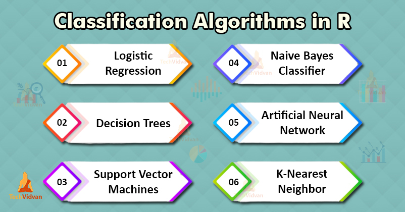
What is R Classification?
Classification is the process of predicting a categorical label of a data object based on its features and properties. In classification, we locate identifiers or boundary conditions that correspond to a particular label or category. We then try to place various unknown objects into those categories, by using the identifiers. An example of this would be to predict the type of water(mineral, tap, smart, etc.), based on its purity and mineral content.R Clustering vs R Classification
In clustering in R, we try to group similar objects together. The principle behind R clustering is that objects in a group are similar to other objects in that set and no objects in different groups are similar to each other. In classification in R, we try to predict a target class. The possible classes are already known and so are all of the classes’ identifying properties. The algorithm needs to identify which class does a data object belong to.Basic Terminologies of R Classification
1. Classifier: A classifier is an algorithm that classifies the input data into output categories. 2. Classification model: A classification model is a model that uses a classifier to classify data objects into various categories. 3. Feature: A feature is a measurable property of a data object. 4. Binary classification: A binary classification is a classification with two possible output categories. 5. Multi-class classification: A multi-class classification is a classification with more than two possible output categories. 6. Multi-label classification: A multi-label classification is a classification where a data object can be assigned multiple labels or output classes.Classification Algorithms in R
There are various classifiers or classification algorithms in machine learning and R programming. We are going to take a look at some of these classifiers.1. R Logistic Regression
As we studied in the logistic regression tutorial, it is a regression algorithm that predicts the value of a categorical variable. It finds the value of a variable that can only take two possible values (ex: pass or fail). Logistic regression finds the relationship between a categorical dependent variable and several independent variables. We can also state this as logistic regression finds the relationship between which class does a data object lies into and said object’s features. Not only does the algorithm find a class for an object, but it also gives justification and reasoning for that object to be in a specific class.2. Decision Trees in R
Decision trees represent a series of decisions and choices in the form of a tree. They use the features of an object to decide which class the object lies in. These classes usually lie on the terminal leavers of a decision tree. Decision trees can be binary or multi-class classifiers. They use multiple rules with binary results to form a series of checks that judge and tell the class of an object according to its features. Decision trees are an example of divide and conquer algorithms as they use the rules to divide the objects repeatedly until a final decision has been made.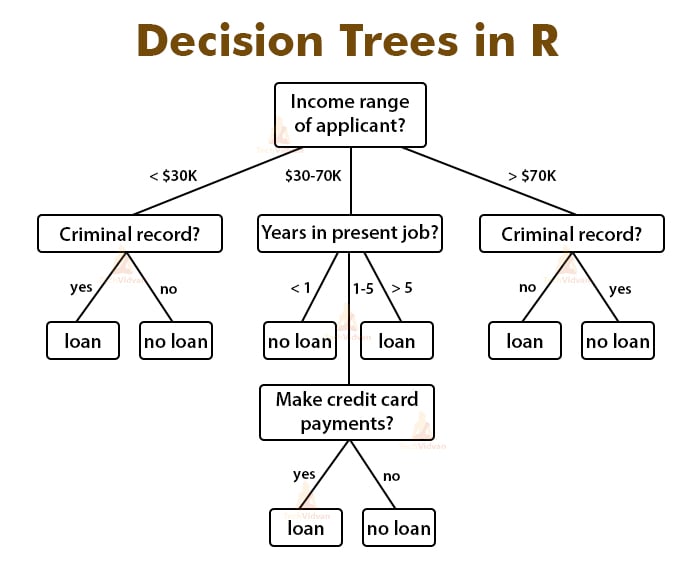
3. Support Vector Machines in R
A support vector machine represents data objects as points in space. It then devises a function that can split the space according to the target output classes. SVM uses the training set to plot objects in space and to fine-tune the function that splits the space. Once the function is finalized, it places the objects in different parts of the space depending on which class they fall into. SVM’s are very lightweight and highly efficient in higher dimensional spaces.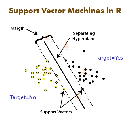
4. Naive Bayes Classifier
Naive Bayes classifier is a classification algorithm based on Bayes’s theorem. It considers all the features of a data object to be independent of each other. They are very fast and useful for large datasets. They achieve very accurate results with very little training. The following is the equation for the Bayes’s theorem: P(Ci|x1,x2,…,xn)=P(x1,x2,…,xn).P(Ci)/P(x1,x2,…,xn) Where C is the target category, And x1, …. , xn are features of a particular object.5. Artificial Neural Networks in R
Artificial neural networks are collections of connections or neurons that connect various nodes. Each connection between two nodes in a neural network represents a relationship between those two nodes. These neurons are arranged in layers in an artificial neural network. Each node contains a non-linear function that it applies to the input and then passes on the output to the next layer. They are feed-forward networks which means that each layer passes on the output to the next layer until a final result is obtained. During the training of the model, different weights are assigned to different layers, connections, and nodes. These weights tell which values and outputs are to be preferred more and by how much. Neural networks are very good when dealing with noisy data.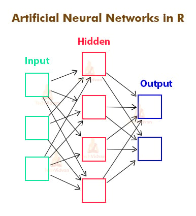
6. K – Nearest Neighbor in R
K-nearest neighbor is a lazy learning algorithm. It maps and stores all of the objects in the training set in an n-dimensional space. It uses the labeled objects to label other objects that are not labeled or classified yet. To label a new object, it looks at its k nearest neighbors. A count is then carried out and the label carried by the majority of the neighbors is assigned to the unlabeled object. This algorithm is very robust for noisy data and also works fine for large datasets. It is, however, more computationally heavy than other classification techniques.Applications of R Classification Algorithms
Now that we have looked at the various classification algorithms. Let’s take a look at their applications: 1. Logistic regression Weather forecast Word classification Symptom classification 2. Decision trees Pattern recognition Pricing decisions Data exploration 3. Support Vector Machines Investment suggestions Stock comparison 4. Naive Bayes Classifier Spam filters Disease prediction Document classification 5. Artificial Neural Network Handwriting analysis Object recognition Voice recognition 6. k-Nearest Neighbor Industrial task classification Video recognition Image recognitionDecision Tree Classifier
It is basically is a graph to represent choices. The nodes or vertices in the graph represent an event and the edges of the graph represent the decision conditions. Its common use is in Machine Learning and Data Mining applications. Applications: Spam/Non-spam classification of email, predicting of a tumor is cancerous or not. Usually, a model is constructed with noted data also called training dataset. Then a set of validation data is used to verify and improve the model. R has packages that are used to create and visualize decision trees. The R package “party” is used to create decision trees. Command: install.packages("party")# Load the party package.
It will automatically load other
# dependent packages.
library(party)
# Create the input data frame.
input.dat <- readingSkills[c(1:105), ]
# Give the chart file a name.
png(file = "decision_tree.png")
# Create the tree.
output.tree <- ctree(
nativeSpeaker ~ age + shoeSize + score,
data = input.dat)
# Plot the tree.
plot(output.tree)
# Save the file.
dev.off()
Output:null device
1
Loading required package: methods
Loading required package: grid
Loading required package: mvtnorm
Loading required package: modeltools
Loading required package: stats4
Loading required package: strucchange
Loading required package: zoo
Attaching package: ‘zoo’
The following objects are masked from ‘package:base’:
as.Date, as.Date.numeric
Loading required package: sandwich
Naive Bayes Classifier
Naïve Bayes classification is a general classification method that uses a probability approach, hence also known as a probabilistic approach based on Bayes’ theorem with the assumption of independence between features. The model is trained on training dataset to make predictions bypredict() function.
Formula:P(A|B)=P(B|A)×P(A)P(B)
It is a sample method in machine learning methods but can be useful in some instances.
The training is easy and fast that just requires considering each predictor in each class separately.
Application:
It is used generally in sentimental analysis.
library(caret)
## Warning: package 'caret' was built under R version 3.4.3
set.seed(7267166)
trainIndex = createDataPartition(mydata$prog, p = 0.7)$Resample1
train = mydata[trainIndex, ]
test = mydata[-trainIndex, ]
## check the balance
print(table(mydata$prog))
##
## academic general vocational
## 105 45 50
print(table(train$prog))
Output:## Naive Bayes Classifier for Discrete Predictors
##
## Call:
## naiveBayes.default(x = X, y = Y, laplace = laplace)
##
## A-priori probabilities:
## Y
## academic general vocational
## 0.5248227 0.2269504 0.2482270
##
## Conditional probabilities:
## science
## Y [, 1] [, 2]
## academic 54.21622 9.360761
## general 52.18750 8.847954
## vocational 47.31429 9.969871
##
## socst
## Y [, 1] [, 2]
## academic 56.58108 9.635845
## general 51.12500 8.377196
## vocational 44.82857 10.279865
K-NN Classifier
Another used classifier is the K-NN classifier. In pattern recognition, the k-nearest neighbor’s algorithm (k-NN) is a non-parametric method generally used for classification and regression. In both cases, the input consists of the k closest training examples in the feature space. In k-NN classification, the output is a class membership. Applications: Used in a variety of applications such as economic forecasting, data compression, and genetics. Example:# Write Python3 code here
import numpy as np
import pandas as pd
from matplotlib import pyplot as plt
from sklearn.datasets import load_breast_cancer
from sklearn.metrics import confusion_matrix
from sklearn.neighbors import KNeighborsClassifier
from sklearn.model_selection import train_test_split
import seaborn as sns
sns.set()
breast_cancer = load_breast_cancer()
X = pd.DataFrame(breast_cancer.data, columns = breast_cancer.feature_names)
X = X[['mean area', 'mean compactness']]
y = pd.Categorical.from_codes(breast_cancer.target, breast_cancer.target_names)
y = pd.get_dummies(y, drop_first = True)
X_train, X_test, y_train, y_test = train_test_split(X, y, random_state = 1)
sns.scatterplot(
x ='mean area',
y ='mean compactness',
hue ='benign',
data = X_test.join(y_test, how ='outer')
)
Output:
Support Vector Machines(SVM’s)
A support vector machine (SVM) is a supervised binary machine learning algorithm that uses classification algorithms for two-group classification problems. After giving an SVM model sets of labeled training data for each category, they’re able to categorize new text. Mainly SVM is used for text classification problems. It classifies the unseen data. It is widely used than Naive Bayes.SVM id usually a fast and dependable classification algorithm that performs very well with a limited amount of data. Applications: SVMs have a number of applications in several fields like Bioinformatics, to classify genes, etc. Example:# Load the data from the csv file
dataDirectory <- "D:/" # put your own folder here
data <- read.csv(paste(dataDirectory, 'regression.csv', sep =""), header = TRUE)
# Plot the data
plot(data, pch = 16)
# Create a linear regression model
model <- lm(Y ~ X, data)
# Add the fitted line
abline(model)
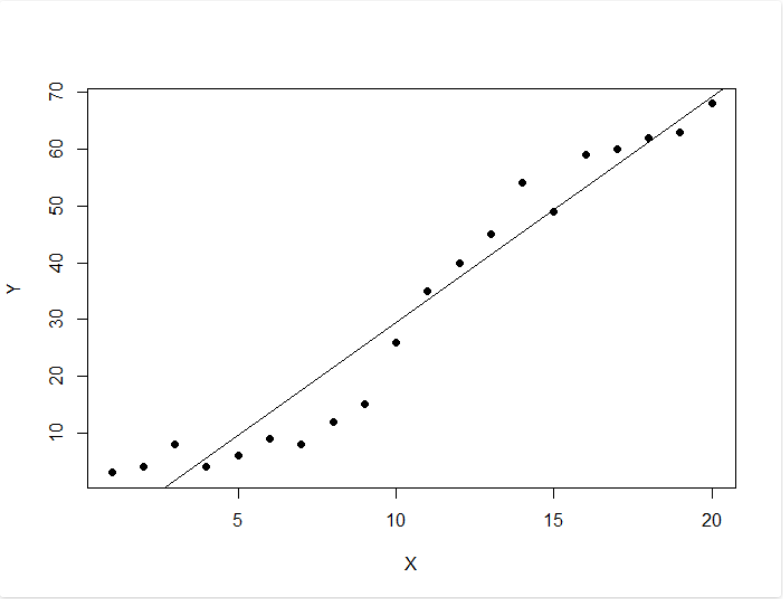
Building Classification Models in R
Building classification models is one of the most important data science use cases. Classification models are models that predict a categorical label. A few examples of this include predicting whether a customer will churn or whether a bank loan will default. In this guide, you will learn how to build and evaluate a classification model in R. We will train the logistic regression algorithm, which is one of the oldest yet most powerful classification algorithms.Data
In this guide, we will use a fictitious dataset of loan applicants containing 600 observations and 10 variables, as described below:Marital_status: Whether the applicant is married ("Yes") or not ("No")
Is_graduate: Whether the applicant is a graduate ("Yes") or not ("No")
Income: Annual Income of the applicant (in USD)
Loan_amount: Loan amount (in USD) for which the application was submitted
Credit_score: Whether the applicant's credit score is good ("Good") or not ("Bad")
Approval_status: Whether the loan application was approved ("Yes") or not ("No")
Age: The applicant's age in years
Sex: Whether the applicant is a male ("M") or a female ("F")
Investment: Total investment in stocks and mutual funds (in USD) as declared by the applicant
Purpose: Purpose of applying for the loan
Let's start by loading the required libraries and the data.
library(plyr)
library(readr)
library(dplyr)
library(caret)
dat <- read_csv("data.csv")
glimpse(dat)
{r}
Output:
1Observations: 600
Variables: 10
$ Marital_status <chr> "Yes", "No", "Yes", "No", "Yes", "Yes", "Yes", "Yes", "Yes", "Ye...
$ Is_graduate <chr> "No", "Yes", "Yes", "Yes", "Yes", "Yes", "Yes", "Yes", "Yes", "Y...
$ Income <int> 30000, 30000, 30000, 30000, 89900, 133300, 136700, 136700, 17320...
$ Loan_amount <int> 60000, 90000, 90000, 90000, 80910, 119970, 123030, 123030, 15588...
$ Credit_score <chr> "Satisfactory", "Satisfactory", "Satisfactory", "Satisfactory", ...
$ approval_status <chr> "Yes", "Yes", "No", "No", "Yes", "No", "Yes", "Yes", "Yes", "No"...
$ Age <int> 25, 29, 27, 33, 29, 25, 29, 27, 33, 29, 25, 29, 27, 33, 29, 30, ...
$ Sex <chr> "F", "F", "M", "F", "M", "M", "M", "F", "F", "F", "M", "F", "F",...
$ Investment <int> 21000, 21000, 21000, 21000, 62930, 93310, 95690, 95690, 121240, ...
$ Purpose <chr> "Education", "Travel", "Others", "Others", "Travel", "Travel", "...
The output shows that the dataset has four numerical (labeled as int) and six character variables (labeled as chr).
We will convert these into factor variables using the line of code below.
1names <- c(1,2,5,6,8,10)
dat[,names] <- lapply(dat[,names] , factor)
glimpse(dat)
{r}
Output:
1Observations: 600
Variables: 10
$ Marital_status <fct> Yes, No, Yes, No, Yes, Yes, Yes, Yes, Yes, Yes, No, No, Yes, Yes...
$ Is_graduate <fct> No, Yes, Yes, Yes, Yes, Yes, Yes, Yes, Yes, Yes, No, Yes, Yes, Y...
$ Income <int> 30000, 30000, 30000, 30000, 89900, 133300, 136700, 136700, 17320...
$ Loan_amount <int> 60000, 90000, 90000, 90000, 80910, 119970, 123030, 123030, 15588...
$ Credit_score <fct> Satisfactory, Satisfactory, Satisfactory, Satisfactory, Satisfac...
$ approval_status <fct> Yes, Yes, No, No, Yes, No, Yes, Yes, Yes, No, No, No, Yes, No, Y...
$ Age <int> 25, 29, 27, 33, 29, 25, 29, 27, 33, 29, 25, 29, 27, 33, 29, 30, ...
$ Sex <fct> F, F, M, F, M, M, M, F, F, F, M, F, F, M, M, M, M, M, M, M, M, M...
$ Investment <int> 21000, 21000, 21000, 21000, 62930, 93310, 95690, 95690, 121240, ...
$ Purpose <fct> Education, Travel, Others, Others, Travel, Travel, Travel, Educa...
Data Partitioning
We will build our model on the training dataset and evaluate its performance on the test dataset. This is called the holdout-validation approach to evaluating model performance. The first line of code below sets the random seed for reproducibility of results. The second line loads thecaTools package that will be used for data partitioning, while the third to fifth lines create the training and test datasets.
The train dataset contains 70 percent of the data (420 observations of 10 variables) while the test data contains the remaining 30 percent (180 observations of 10 variables).
set.seed(100)
library(caTools)
spl = sample.split(dat$approval_status, SplitRatio = 0.7)
train = subset(dat, spl==TRUE)
test = subset(dat, spl==FALSE)
print(dim(train)); print(dim(test))
{r}
Output:
1[1] 420 10
[1] 180 10
Build, Predict and Evaluate the Model
To fit the logistic regression model, the first step is to instantiate the algorithm. This is done in the first line of code below with theglm() function.
The second line prints the summary of the trained model.
1model_glm = glm(approval_status ~ . , family="binomial", data = train)
summary(model_glm)
{r}
Output:
1Call:
glm(formula = approval_status ~ ., family = "binomial", data = train)
Deviance Residuals:
Min 1Q Median 3Q Max
-2.19539 -0.00004 0.00004 0.00008 2.47763
Coefficients:
Estimate Std.
Error z value Pr(>|z|)
(Intercept) 6.238e-02 9.052e+03 0.000 1.0000
Marital_statusYes 4.757e-01 4.682e-01 1.016 0.3096
Is_graduateYes 5.647e-01 4.548e-01 1.242 0.2144
Income 2.244e-06 1.018e-06 2.204 0.0275 *
Loan_amount -3.081e-07 3.550e-07 -0.868 0.3854
Credit_scoreSatisfactory 2.364e+01 8.839e+03 0.003 0.9979
Age -7.985e-02 1.360e-02 -5.870 4.35e-09 ***
SexM -5.879e-01 6.482e-01 -0.907 0.3644
Investment -2.595e-06 1.476e-06 -1.758 0.0787 .
PurposeHome 2.599e+00 9.052e+03 0.000 0.9998
PurposeOthers -4.172e+01 3.039e+03 -0.014 0.9890
PurposePersonal 1.577e+00 2.503e+03 0.001 0.9995
PurposeTravel -1.986e+01 1.954e+03 -0.010 0.9919
---
Signif. codes: 0 ‘***’ 0.001 ‘**’ 0.01 ‘*’ 0.05 ‘.’ 0.1 ‘ ’ 1
(Dispersion parameter for binomial family taken to be 1)
Null deviance: 524.44 on 419 degrees of freedom
Residual deviance: 166.96 on 407 degrees of freedom
AIC: 192.96
Number of Fisher Scoring iterations: 19
The significance code ‘***’ in the above output shows the relative importance of the feature variables.
Let's evaluate the model further, starting by setting the baseline accuracy using the code below.
Since the majority class of the target variable has a proportion of 0.68, the baseline accuracy is 68 percent.
1#Baseline Accuracy
prop.table(table(train$approval_status))
{r}
Output:
1 No Yes
.3166667 0.6833333
Let's now evaluate the model performance on the training and test data, which should ideally be better than the baseline accuracy.
We start by generating predictions on the training data, using the first line of code below.
The second line creates the confusion matrix with a threshold of 0.5, which means that for probability predictions equal to or greater than 0.5, the algorithm will predict the Yes response for the approval_status variable.
The third line prints the accuracy of the model on the training data, using the confusion matrix, and the accuracy comes out to be 91 percent.
We then repeat this process on the test data, and the accuracy comes out to be 88 percent.
1# Predictions on the training set
predictTrain = predict(model_glm, data = train, type = "response")
# Confusion matrix on training data
table(train$approval_status, predictTrain >= 0.5)
(114+268)/nrow(train) #Accuracy - 91%
#Predictions on the test set
predictTest = predict(model_glm, newdata = test, type = "response")
# Confusion matrix on test set
table(test$approval_status, predictTest >= 0.5)
158/nrow(test) #Accuracy - 88%
{r}
Output:
1# Confusion matrix and accuracy on training data
FALSE TRUE
No 114 19
Yes 19 268
[1] 0.9095238
# Confusion matrix and accuracy on testing data
FALSE TRUE
No 44 13
Yes 9 114
[1] 0.8777778
Conclusion
In this guide, you have learned techniques of building a classification model in R using the powerful logistic regression algorithm. The baseline accuracy for the data was 68 percent, while the accuracy on the training and test data was 91 percent, and 88 percent, respectively. Overall, the logistic regression model is beating the baseline accuracy by a big margin on both the train and test datasets, and the results are very good. To learn more about data science using R, please refer to the following guides: Interpreting Data Using Descriptive Statistics with R Interpreting Data Using Statistical Models with R Time Series Forecasting Using R Hypothesis Testing - Interpreting Data with Statistical Models Machine Learning with Text Data Using R Visualization of Text Data Using Word Cloud in R Exploring Data Visually with R Coping with Missing, Invalid and Duplicate Data in R Reshaping Data with R Working with Data Types in R Splitting and Combining Data with R Linear, Lasso, and Ridge Regression with RHow to perform a Logistic Regression in R
Logistic Regression is similar to linear regressionHow to perform a Logistic Regression in R
Logistic regression implementation in R
The dataset
The data cleaning process
Taking care of the missing values
Model fitting
Interpreting the results of our logistic regression model
Assessing the predictive ability of the model
Generalized Linear Models
Logistic Regression
Poisson Regression
Survival Analysis
Logistic regression is a method for fitting a regression curve, y = f(x), when y is a categorical variable.
The typical use of this model is predicting y given a set of predictors x.
The predictors can be continuous, categorical or a mix of both.
The categorical variable y, in general, can assume different values.
In the simplest case scenario y is binary meaning that it can assume either the value 1 or 0.
A classical example used in machine learning is email classification: given a set of attributes for each email such as number of words, links and pictures, the algorithm should decide whether the email is spam (1) or not (0).
In this post we call the model “binomial logistic regression”, since the variable to predict is binary, however, logistic regression can also be used to predict a dependent variable which can assume more than 2 values.
In this second case we call the model “multinomial logistic regression”.
A typical example for instance, would be classifying films between “Entertaining”, “borderline” or “boring”.
Logistic regression implementation in R
The dataset
The data cleaning process
Taking care of the missing values
Model fitting
Interpreting the results of our logistic regression model
Assessing the predictive ability of the model
Generalized Linear Models
Logistic Regression
Poisson Regression
Survival Analysis
Logistic regression implementation in R
R makes it very easy to fit a logistic regression model. The function to be called isglm() and the fitting process is not so different from the one used in linear regression.
In this post I am going to fit a binary logistic regression model and explain each step.
The dataset
We’ll be working on the Titanic dataset. There are different versions of this datasets freely available online, however I suggest to use the one available at Kaggle, since it is almost ready to be used (in order to download it you need to sign up to Kaggle). The dataset (training) is a collection of data about some of the passengers (889 to be precise), and the goal of the competition is to predict the survival (either 1 if the passenger survived or 0 if they did not) based on some features such as the class of service, the sex, the age etc. As you can see, we are going to use both categorical and continuous variables.The data cleaning process
When working with a real dataset we need to take into account the fact that some data might be missing or corrupted, therefore we need to prepare the dataset for our analysis. As a first step we load the csv data using theread.csv() function.
Make sure that the parameter na.strings is equal to c("") so that each missing value is coded as a NA.
This will help us in the next steps.
training.data.raw <- read.csv('train.csv',header=T,na.strings=c(""))
Now we need to check for missing values and look how many unique values there are for each variable using the sapply() function which applies the function passed as argument to each column of the dataframe.
sapply(training.data.raw,function(x) sum(is.na(x)))
PassengerId Survived Pclass Name Sex
0 0 0 0 0
Age SibSp Parch Ticket Fare
177 0 0 0 0
Cabin Embarked
687 2
sapply(training.data.raw, function(x) length(unique(x)))
PassengerId Survived Pclass Name Sex
891 2 3 891 2
Age SibSp Parch Ticket Fare
89 7 7 681 248
Cabin Embarked
148 4
A visual take on the missing values might be helpful: the Amelia package has a special plotting function missmap() that will plot your dataset and highlight missing values:
library(Amelia)
missmap(training.data.raw, main = "Missing values vs observed")
 The variable cabin has too many missing values, we will not use it.
We will also drop PassengerId since it is only an index and Ticket.
Using the
The variable cabin has too many missing values, we will not use it.
We will also drop PassengerId since it is only an index and Ticket.
Using the subset() function we subset the original dataset selecting the relevant columns only.
data <- subset(training.data.raw,select=c(2,3,5,6,7,8,10,12))
Taking care of the missing values
Now we need to account for the other missing values. R can easily deal with them when fitting a generalized linear model by setting a parameter inside the fitting function. However, personally I prefer to replace theNAs “by hand”, when is possible.
There are different ways to do this, a typical approach is to replace the missing values with the average, the median or the mode of the existing one.
I’ll be using the average.
data$Age[is.na(data$Age)] <- mean(data$Age,na.rm=T)
As far as categorical variables are concerned, using the read.table() or read.csv() by default will encode the categorical variables as factors.
A factor is how R deals categorical variables.
We can check the encoding using the following lines of code
is.factor(data$Sex)
TRUE
is.factor(data$Embarked)
TRUE
For a better understanding of how R is going to deal with the categorical variables, we can use the contrasts() function.
This function will show us how the variables have been dummyfied by R and how to interpret them in a model.
contrasts(data$Sex)
male
female 0
male 1
contrasts(data$Embarked)
Q S
C 0 0
Q 1 0
S 0 1
For instance, you can see that in the variable sex, female will be used as the reference.
As for the missing values in Embarked, since there are only two, we will discard those two rows (we could also have replaced the missing values with the mode and keep the datapoints).
data <- data[!is.na(data$Embarked),]
rownames(data) <- NULL
Before proceeding to the fitting process, let me remind you how important is cleaning and formatting of the data.
This preprocessing step often is crucial for obtaining a good fit of the model and better predictive ability.
Model fitting
We split the data into two chunks: training and testing set. The training set will be used to fit our model which we will be testing over the testing set. train <- data[1:800,] test <- data[801:889,] Now, let’s fit the model. Be sure to specify the parameterfamily=binomial in the glm() function.
model <- glm(Survived ~.,family=binomial(link='logit'),data=train)
By using function summary() we obtain the results of our model:
summary(model)
Call:
glm(formula = Survived ~ ., family = binomial(link = "logit"),
data = train)
Deviance Residuals:
Min 1Q Median 3Q Max
-2.6064 -0.5954 -0.4254 0.6220 2.4165
Coefficients:
Estimate Std.
Error z value Pr(>|z|)
(Intercept) 5.137627 0.594998 8.635 < 2e-16 ***
Pclass -1.087156 0.151168 -7.192 6.40e-13 ***
Sexmale -2.756819 0.212026 -13.002 < 2e-16 ***
Age -0.037267 0.008195 -4.547 5.43e-06 ***
SibSp -0.292920 0.114642 -2.555 0.0106 *
Parch -0.116576 0.128127 -0.910 0.3629
Fare 0.001528 0.002353 0.649 0.5160
EmbarkedQ -0.002656 0.400882 -0.007 0.9947
EmbarkedS -0.318786 0.252960 -1.260 0.2076
---
Signif.
codes: 0 ‘***’ 0.001 ‘**’ 0.01 ‘*’ 0.05 ‘.’ 0.1 ‘ ’ 1
(Dispersion parameter for binomial family taken to be 1)
Null deviance: 1065.39 on 799 degrees of freedom
Residual deviance: 709.39 on 791 degrees of freedom
AIC: 727.39
Number of Fisher Scoring iterations: 5
Interpreting the results of our logistic regression model
Now we can analyze the fitting and interpret what the model is telling us. First of all, we can see that SibSp, Fare and Embarked are not statistically significant. As for the statistically significant variables, sex has the lowest p-value suggesting a strong association of the sex of the passenger with the probability of having survived. The negative coefficient for this predictor suggests that all other variables being equal, the male passenger is less likely to have survived. Remember that in the logit model the response variable is log odds: ln(odds) = ln(p/(1-p)) = a*x1 + b*x2 + … + z*xn. Since male is a dummy variable, being male reduces the log odds by 2.75 while a unit increase in age reduces the log odds by 0.037. Now we can run theanova() function on the model to analyze the table of deviance
anova(model, test="Chisq")
Analysis of Deviance Table
Model: binomial, link: logit
Response: Survived
Terms added sequentially (first to last)
Df Deviance Resid.
Df Resid.
Dev Pr(>Chi)
NULL 799 1065.39
Pclass 1 83.607 798 981.79 < 2.2e-16 ***
Sex 1 240.014 797 741.77 < 2.2e-16 ***
Age 1 17.495 796 724.28 2.881e-05 ***
SibSp 1 10.842 795 713.43 0.000992 ***
Parch 1 0.863 794 712.57 0.352873
Fare 1 0.994 793 711.58 0.318717
Embarked 2 2.187 791 709.39 0.334990
---
Signif.
codes: 0 ‘***’ 0.001 ‘**’ 0.01 ‘*’ 0.05 ‘.’ 0.1 ‘ ’ 1
The difference between the null deviance and the residual deviance shows how our model is doing against the null model (a model with only the intercept).
The wider this gap, the better.
Analyzing the table we can see the drop in deviance when adding each variable one at a time.
Again, adding Pclass, Sex and Age significantly reduces the residual deviance.
The other variables seem to improve the model less even though SibSp has a low p-value.
A large p-value here indicates that the model without the variable explains more or less the same amount of variation.
Ultimately what you would like to see is a significant drop in deviance and the AIC.
While no exact equivalent to the R2 of linear regression exists, the McFadden R2 index can be used to assess the model fit.
library(pscl)
pR2(model)
llh llhNull G2 McFadden r2ML r2CU
-354.6950111 -532.6961008 356.0021794 0.3341513 0.3591775 0.4880244
Assessing the predictive ability of the model
In the steps above, we briefly evaluated the fitting of the model, now we would like to see how the model is doing when predicting y on a new set of data. By setting the parametertype='response', R will output probabilities in the form of P(y=1|X).
Our decision boundary will be 0.5.
If P(y=1|X) > 0.5 then y = 1 otherwise y=0.
Note that for some applications different thresholds could be a better option.
fitted.results <- predict(model,newdata=subset(test,select=c(2,3,4,5,6,7,8)),type='response')
fitted.results <- ifelse(fitted.results > 0.5,1,0)
misClasificError <- mean(fitted.results != test$Survived)
print(paste('Accuracy',1-misClasificError))
"Accuracy 0.842696629213483"
The 0.84 accuracy on the test set is quite a good result.
However, keep in mind that this result is somewhat dependent on the manual split of the data that I made earlier, therefore if you wish for a more precise score, you would be better off running some kind of cross validation such as k-fold cross validation.
As a last step, we are going to plot the ROC curve and calculate the AUC (area under the curve) which are typical performance measurements for a binary classifier.
The ROC is a curve generated by plotting the true positive rate (TPR) against the false positive rate (FPR) at various threshold settings while the AUC is the area under the ROC curve.
As a rule of thumb, a model with good predictive ability should have an AUC closer to 1 (1 is ideal) than to 0.5.
library(ROCR)
p <- predict(model, newdata=subset(test,select=c(2,3,4,5,6,7,8)), type="response")
pr <- prediction(p, test$Survived)
prf <- performance(pr, measure = "tpr", x.measure = "fpr")
plot(prf)
auc <- performance(pr, measure = "auc")
auc <- [email protected][[1]]
auc
0.8647186
And here is the ROC plot: